
Vendor Dashboard: Walkthrough
Scrut's Vendor Dashboard is a powerful tool that empowers you to manage third-party risk efficiently. It provides clear insights into vendor assessments, risk scores, questionnaire progress, mitigation tasks, and risk distribution. With interactive visualizations and global filters, the dashboard provides a holistic view of your vendor landscape, helping you identify areas for improvement and streamline the vendor assessment processes. In this guide, we explain how to access this dashboard and walk you through its key features.
How to Access the Vendor Dashboard
Follow these steps to open the vendor dashboard:
-
Log in to Scrut using your credentials.
-
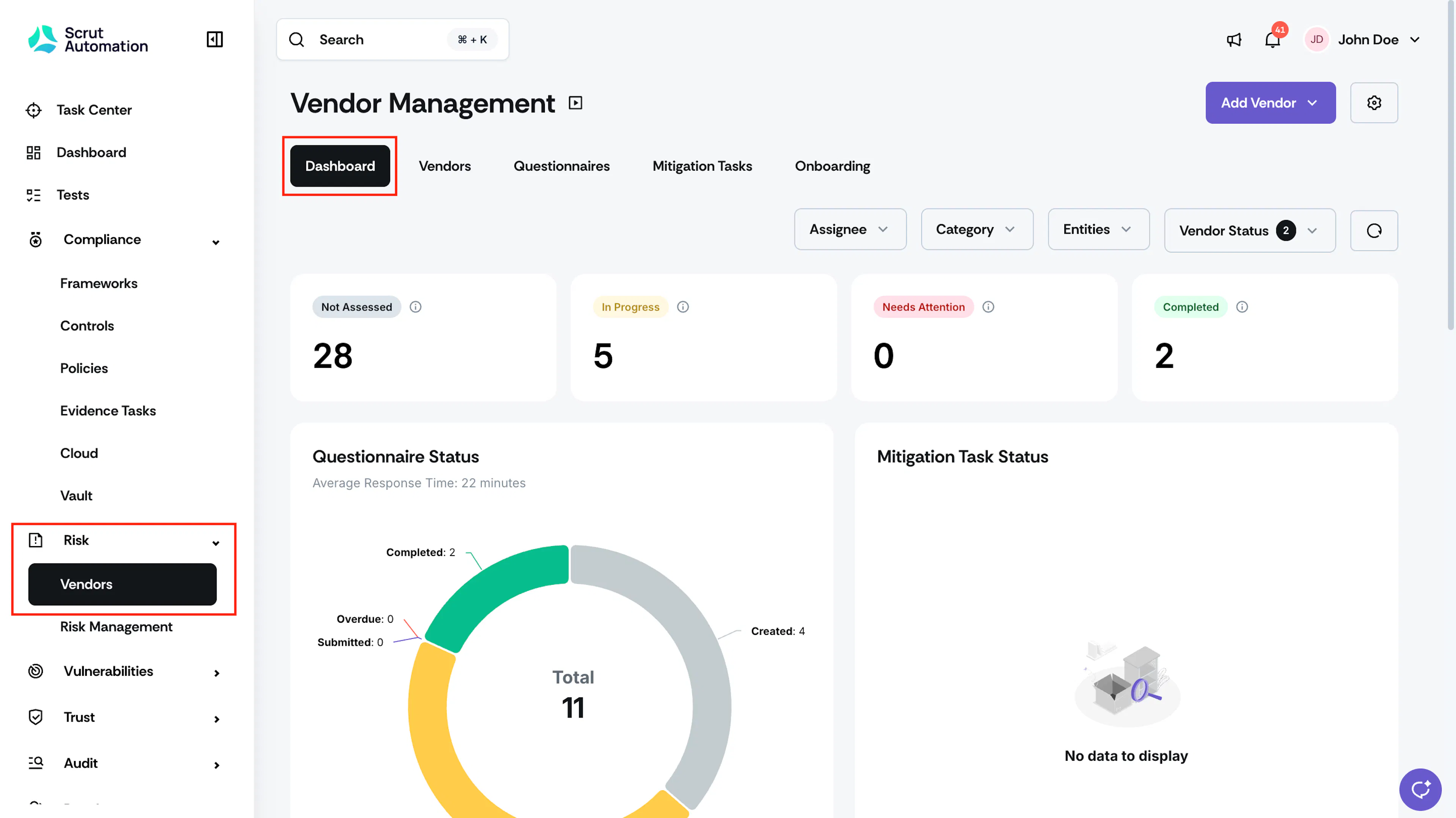
Click Risk → Vendors on the left navigation panel.
-
This brings you to the vendor dashboard, where you can view all relevant metrics for all your vendors.
Pro Tip:
First-time accessing the vendor module? Check our quick start guide for the end-to-end workflow.
Understanding the Dashboard
The Vendor Dashboard is divided into several sections that provide actionable insights into vendor risks. Here's a detailed breakdown of each section:
1. Dashboard Filters
Customize the data on the dashboard by using the filters at the top of the page.

-
Assignee: This filter lets you narrow the vendor data on the dashboard by specific assignees. You can also use it to see data on vendors:
- With No Assignees
- Assigned specifically to you
-
Category: Use this filter to view data based on different vendor categories.
-
Entities: This option allows you to filter the dashboard data by specific entities.
Pro Tip!
Click the Reset button to the right of the filters to remove all applied filters.
2. Assessment Metric Cards

At the top of the dashboard are the metric cards, which provide a quick snapshot of the assessment status of existing vendors.
- Not Assessed: Number of vendors pending assessment.
- In Progress: Number of vendors currently undergoing assessment.
- Completed: Number of vendors with completed assessment (either on or off the platform).
- Needs Attention: Number of vendors overdue for assessment based on the recurrence schedule.
3. Questionnaire Status
Who can use this feature
- Supported on Growth and Scale plans
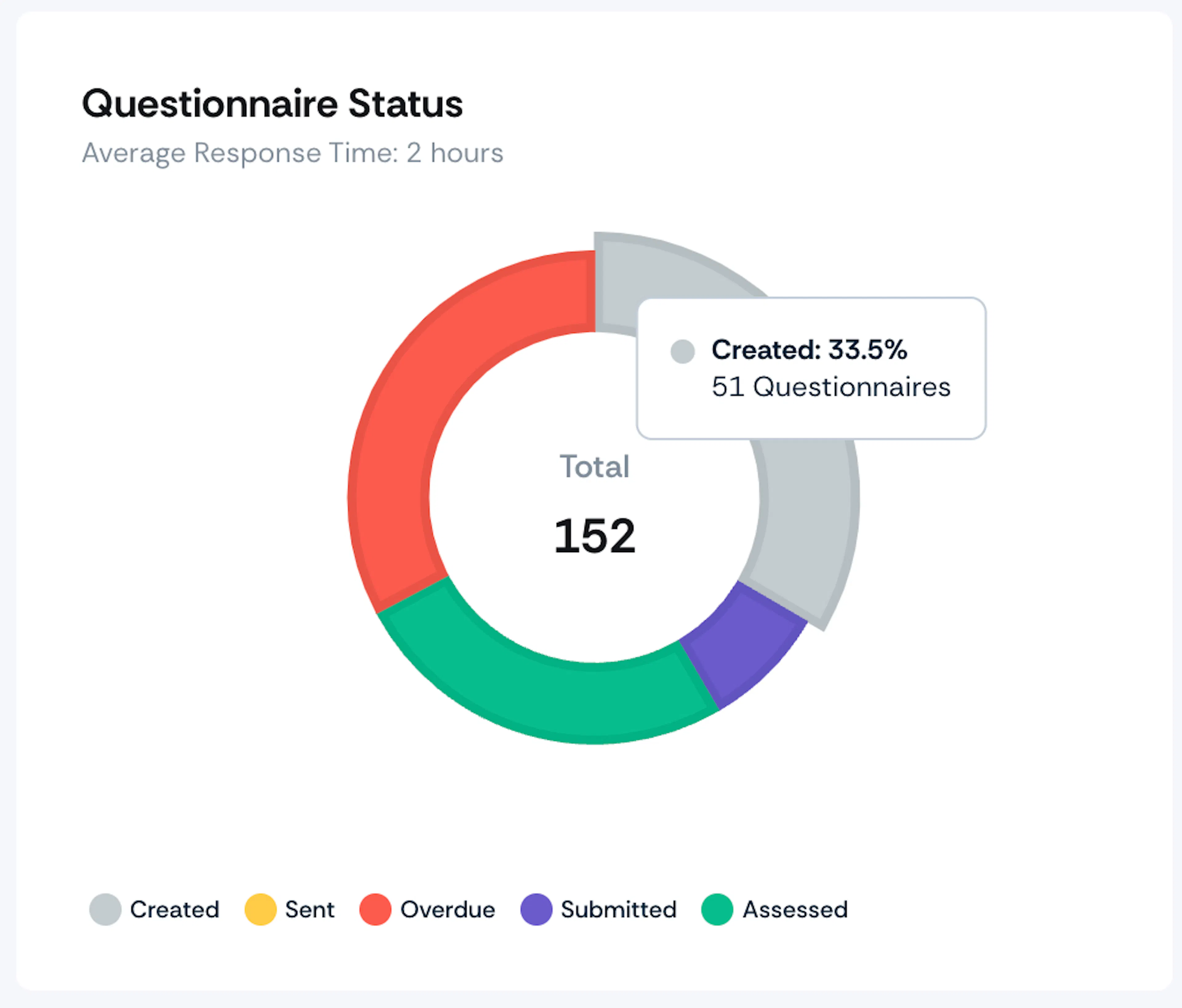
This chart provides a visual breakdown of the completion stages of the questionnaires you've sent to vendors using Scrut. Here's what each status means:
- Created: This indicates the number of questionnaires you have created in Scrut but have not yet sent to vendors.
- Sent: This shows the number of questionnaires that you have shared with vendors via Scrut.
- Overdue: This represents the number of questionnaires that have passed their submission deadline and for which vendors have not yet provided a response.
- Submitted: This indicates the number of questionnaires that vendors have completed and returned.
- Assessed: This refers to the number of questionnaires that you or your team has reviewed.
Additionally, the chart features an Average Response Time metric, which provides insights into the average duration it takes for vendors to respond to the questionnaires.
Pro Tip:
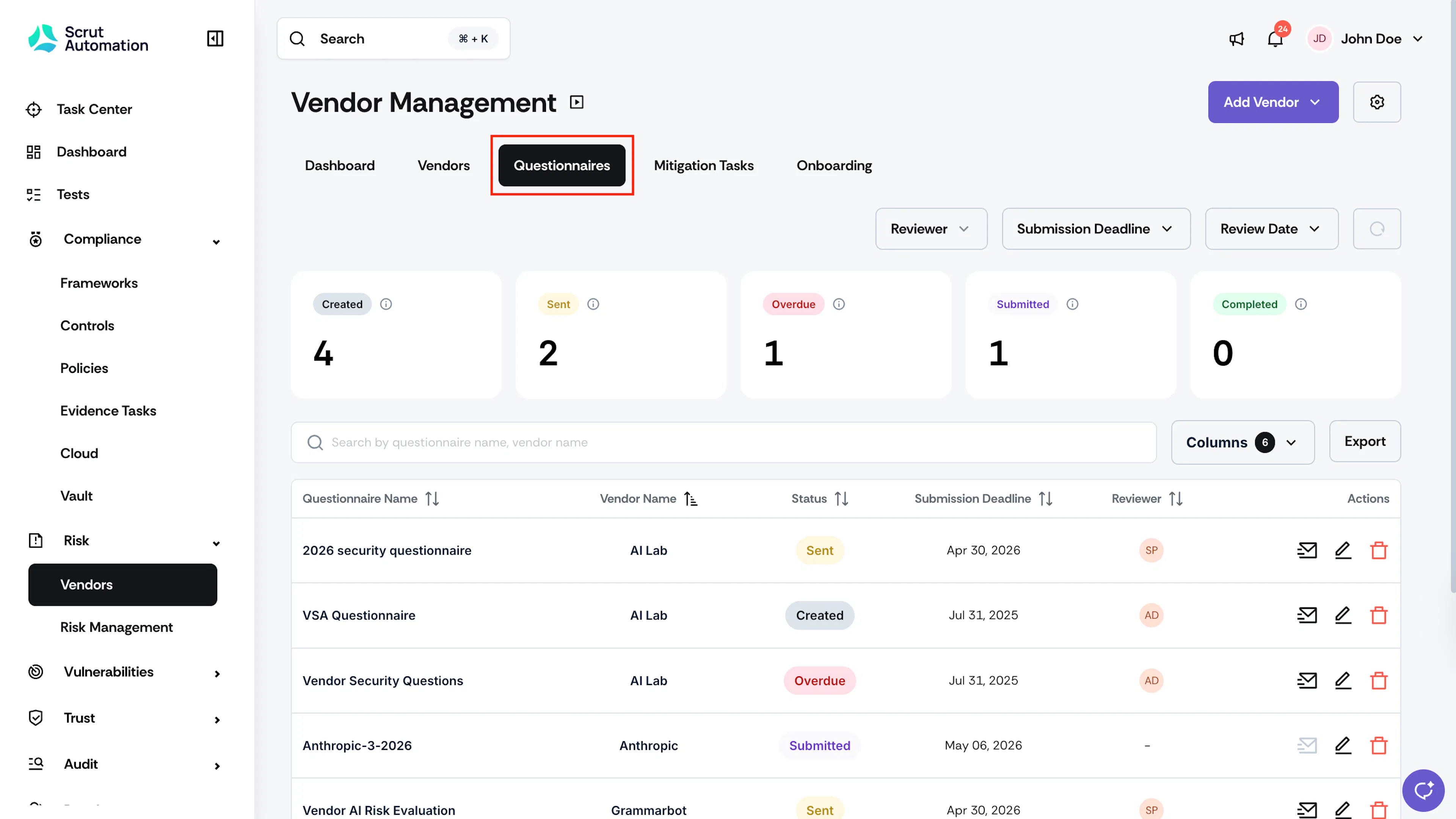
Click on any status in the chart to view all questionnaires associated with that particular status.
4. Mitigation Tasks Status
Who can use this feature
- Supported on Growth and Scale plans
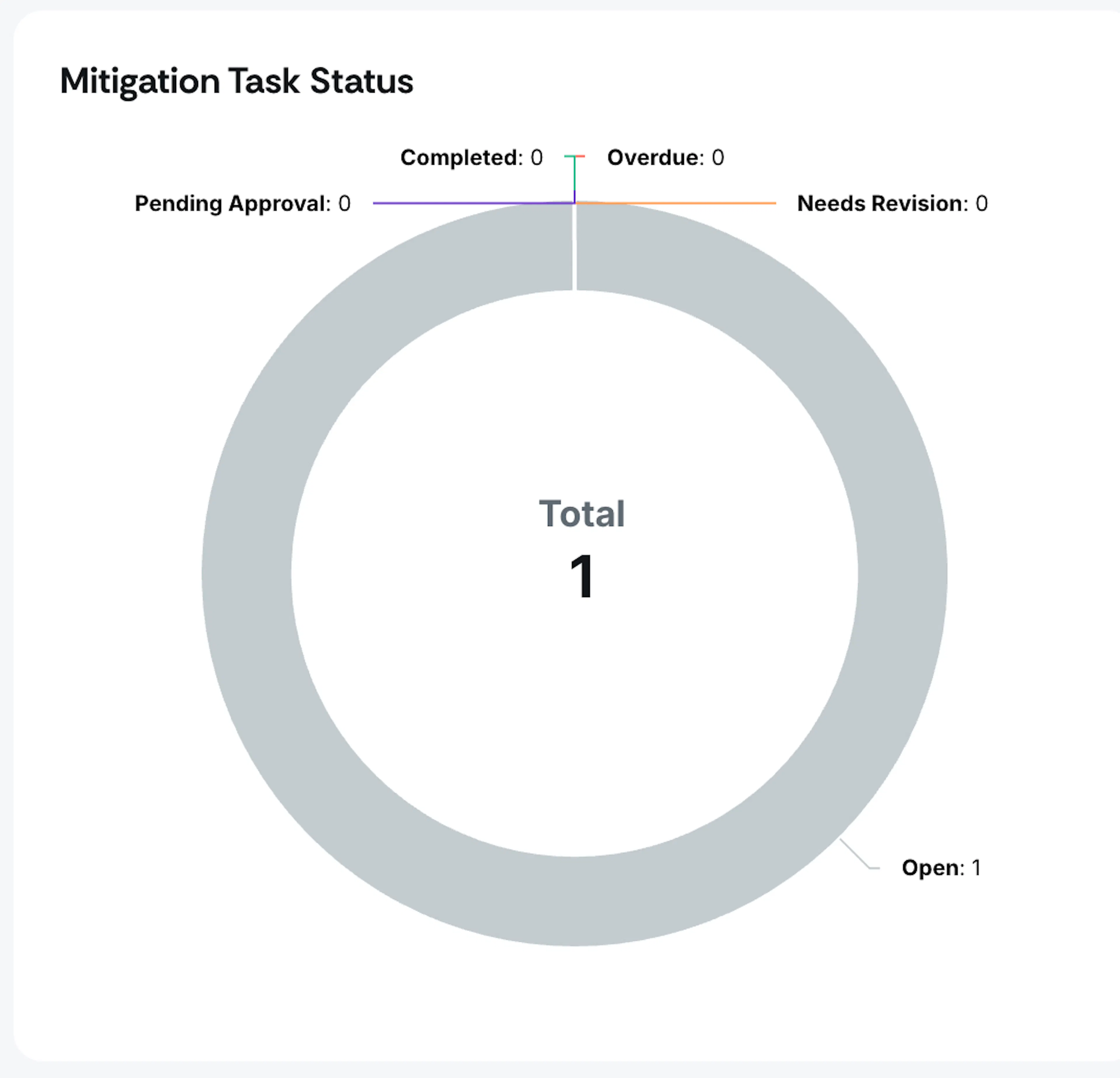
This chart shows the progress of vendor tasks, indicating whether they are:
- Open: Open tasks that are not due
- Overdue: Open tasks that are overdue
- Pending Approval: Tasks submitted by the assignee that need to be reviewed by the approver
- Needs Revision: Tasks that have been reviewed and need resubmission by the assignee
- Completed: Tasks that are reviewed and closed
Pro Tip:
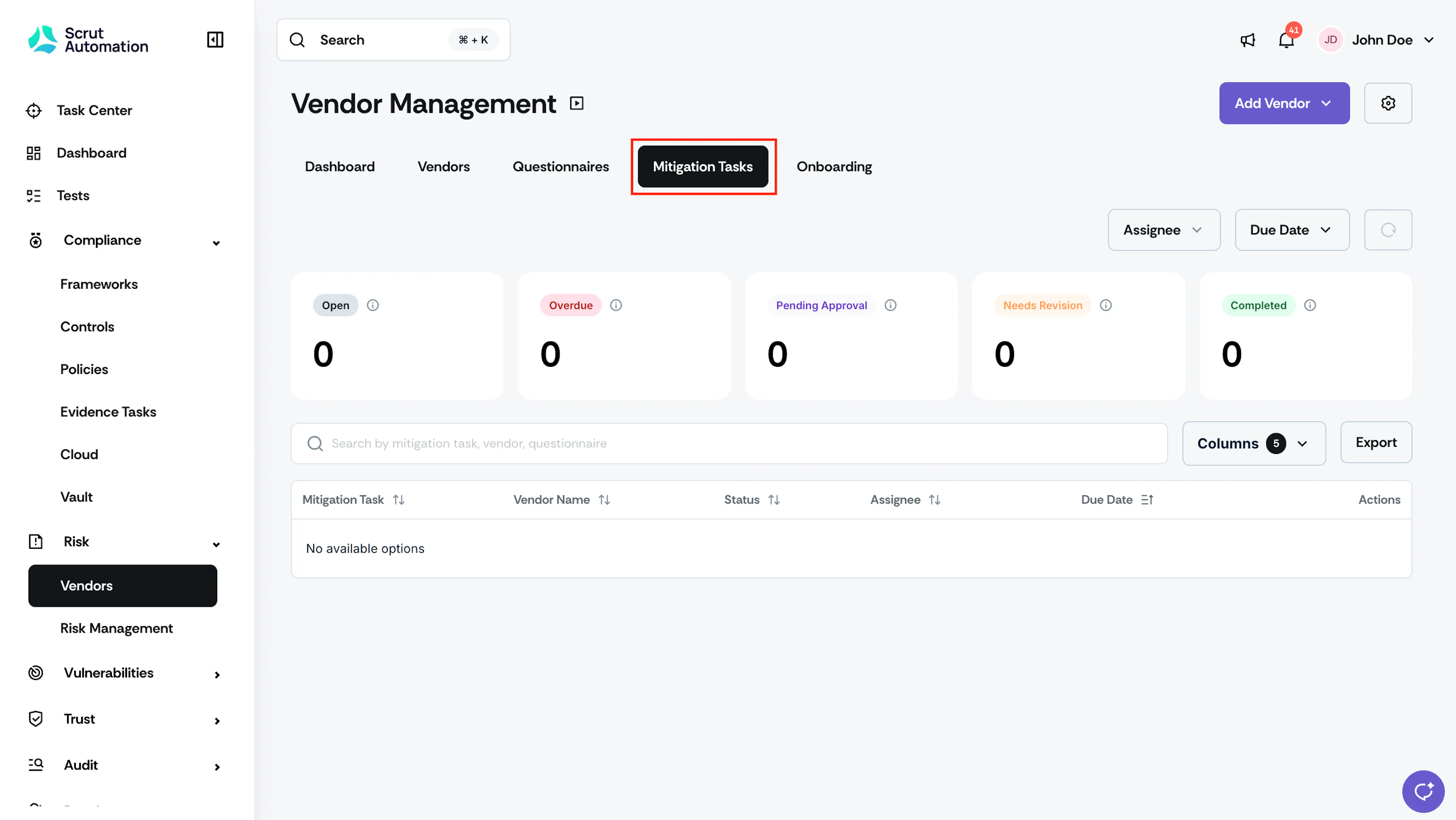
Click on any status to open the mitigation tasks tab with that status as the filter.
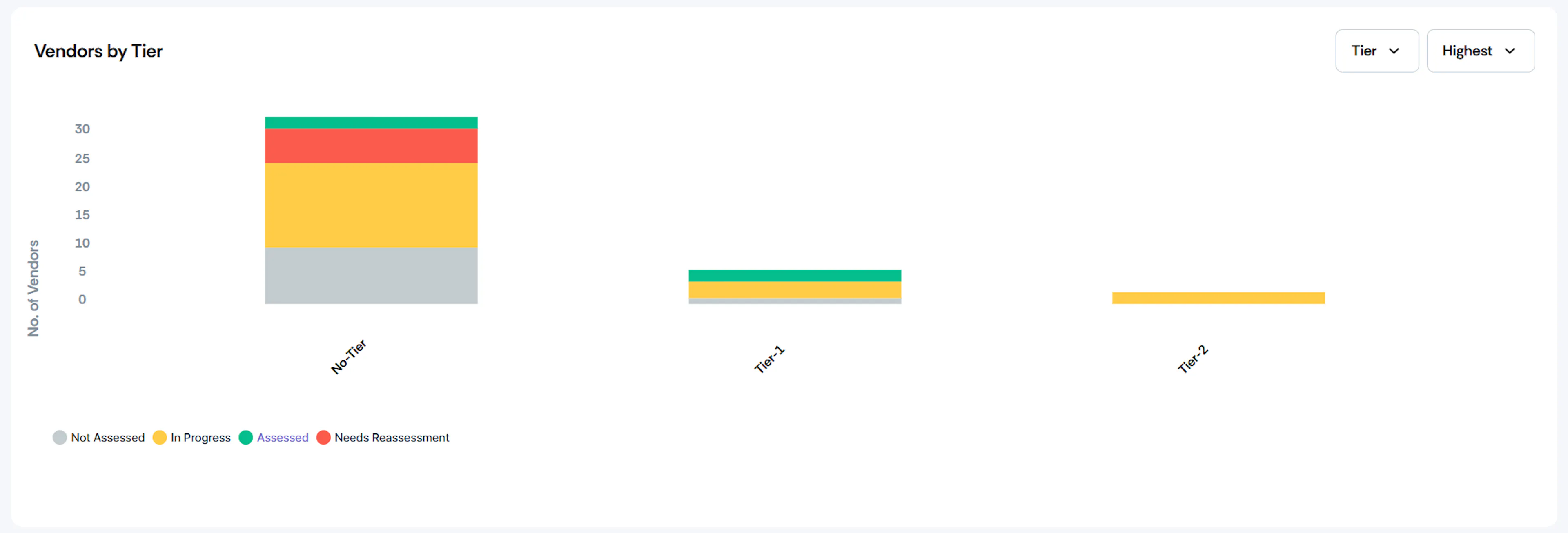
5. Vendors by Category/Tier
This bar chart helps you view all vendors classified based on categories or tiers. Use the View By filter to switch between category and tier views.
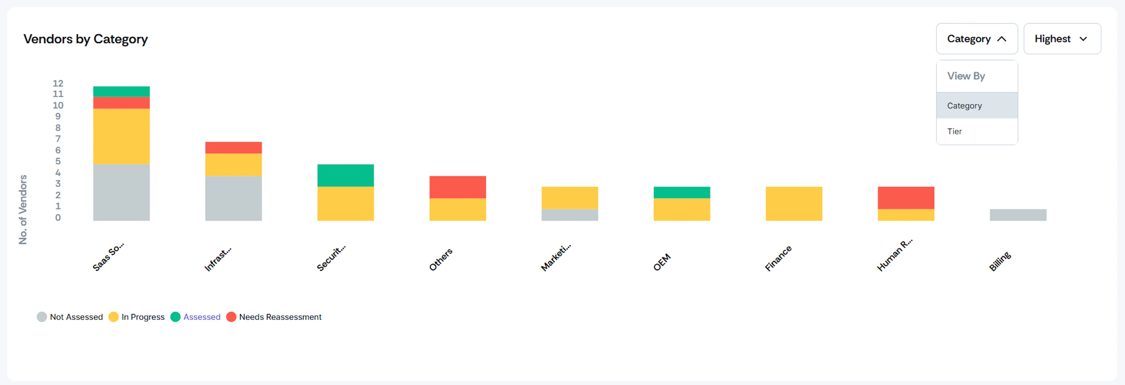
Category View: This view features a stacked bar graph that displays the number of vendors in each category and their assessment status (Not Assessed, In Progress, Assessed, Needs Reassessment). It provides a quick overview of how vendor assessments are spread across categories in your organization.
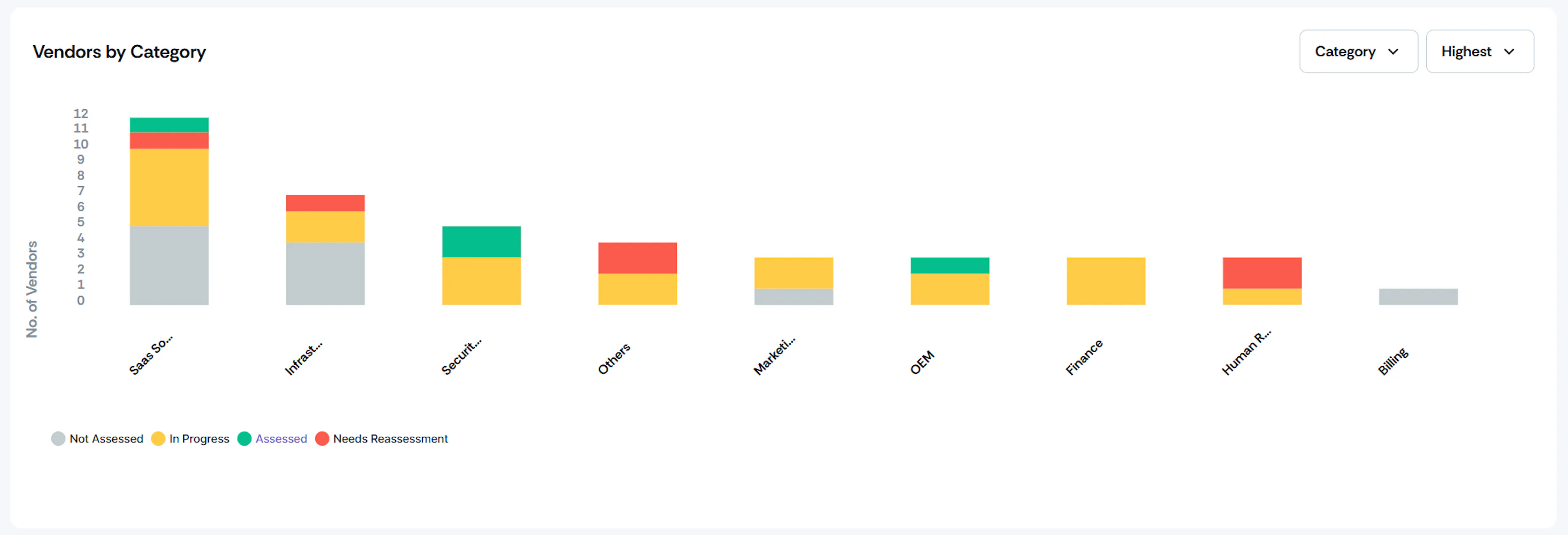
Tier View: This view also features a stacked bar graph that displays the number of vendors in each tier and their assessment status. It helps you analyze how vendor assessments vary across different tiers in your organization.
Pro Tip!
Use the Sort By filter to rearrange the vendor order in this chart from highest to lowest or vice versa.
6. Inherent and Residual Risk Chart
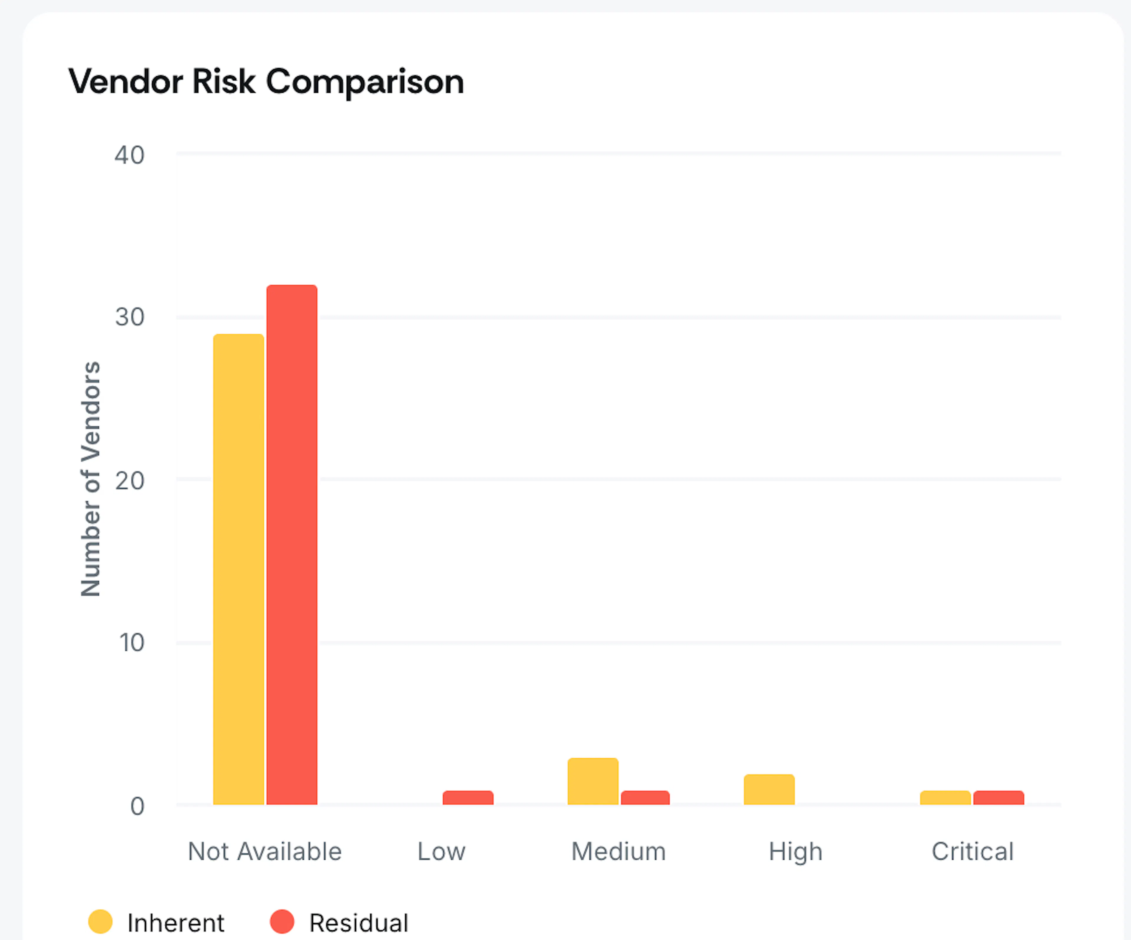
- Inherent Risk Chart: Shows vendors grouped by their inherent risk levels (Critical, High, Medium, Low, and Not Available).
- Residual Risk Chart: Shows how vendors are distributed across risk levels after your risk mitigation efforts (Critical, High, Medium, Low, and Not Available).
7. Vendors by Assignee
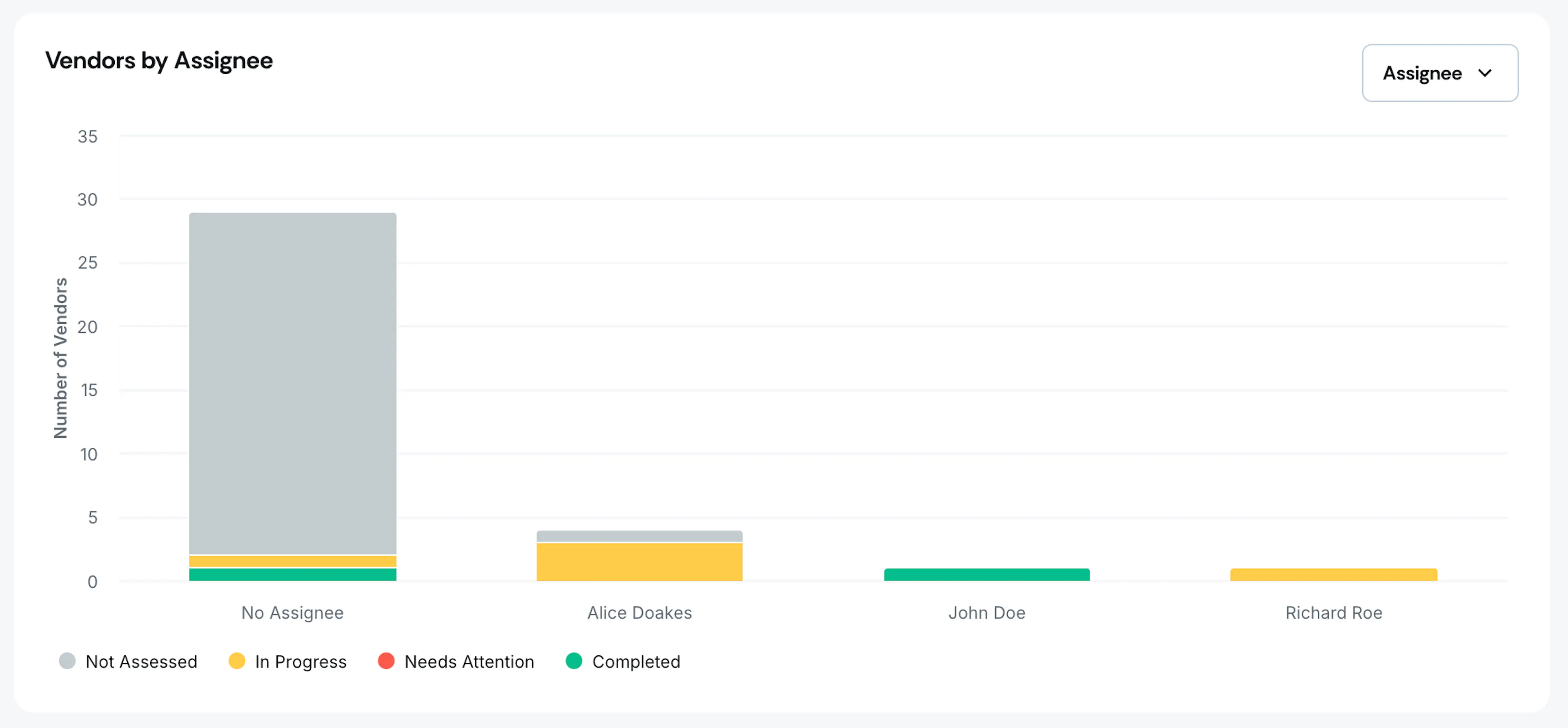
This bar graph shows the number of vendors for each assignee along with the vendor status (Not Assessed, In Progress, Assessed). It provides a quick overview of the workload for different assignees and their progress in managing vendor assessments.
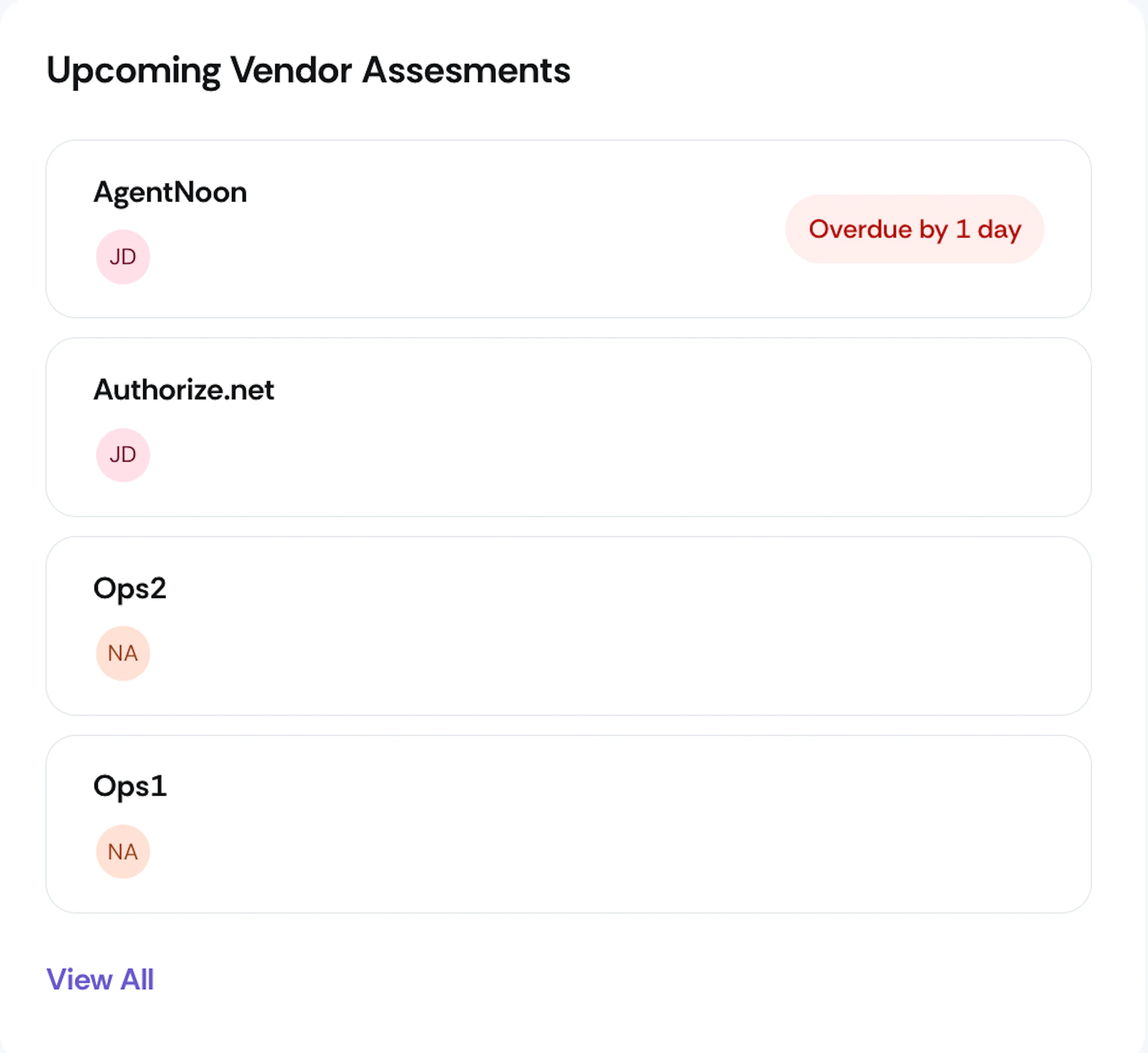
8. Upcoming Vendor Assessments
This chart shows the list of vendors requiring immediate attention and those due for assessment in the next 30 days. Click the View All button to access the vendor page for more detailed information about each vendor on this list.