
Risks: Walkthrough
Who can use this feature
- Supported on Foundation, Growth, and Scale plans
The Risk Dashboard in the Risk Module features intuitive graphs and metrics cards that provide a visual representation of your risks. It also includes a Risk Heat Map and Risk Trends graph that provide a clear overview of your risk landscape. Learn how to use the Risk Dashboard to understand your risks better.
How to Access the Risk Dashboard
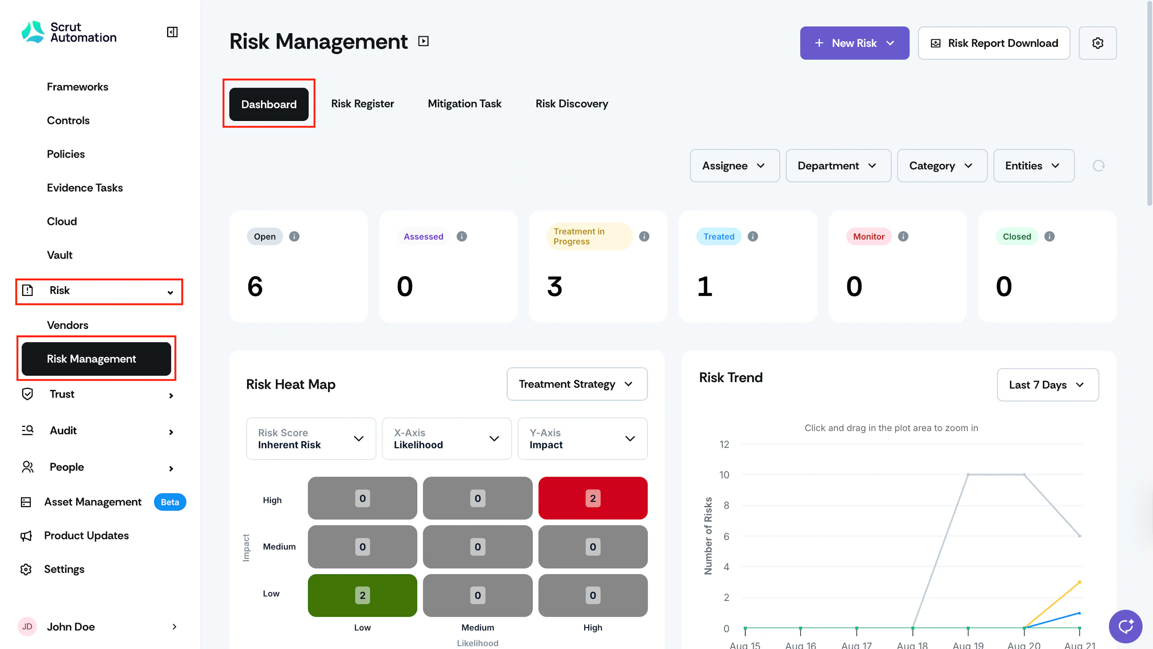
- Sign in to Scrut and click Risk → Risk Management on the left side panel.
- This brings you to the Risk Dashboard, where you can view all the relevant risk metrics and graphs.
What’s included in it?
The Risk Dashboard consists of multiple sections, each showcasing its metrics to provide immediate insights. These sections include:
Dashboard Filters
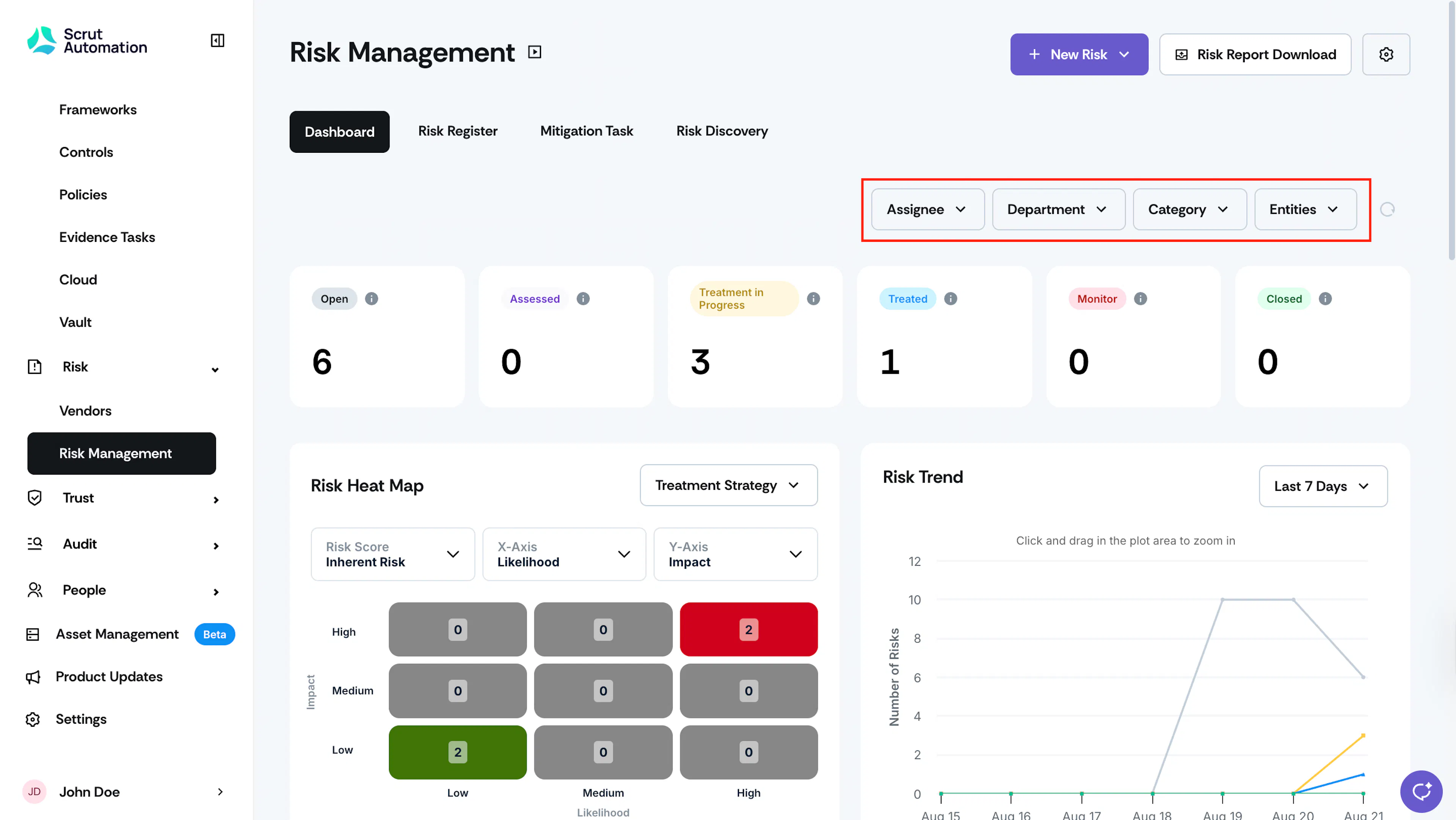
The dashboard provides four primary filters to refine the data according to your requirements. They are :
-
Assignee: The Assignee dropdown provides a complete list of Risk assignees, with priority given to "No Assignee" and an option to filter Risks assigned to you.
-
Department: Users can easily navigate through all available departments and filter relevant ones with this dropdown.
-
Category: The Category dropdown provides a list of categories to which each risk belongs.
-
Entities: This dropdown contains a comprehensive list of entities that the user has configured in the Entities section.
- Note: The Risk Trend Graph and Mitigation Tasks chart do not support filtering by entities.
Pro Tip!
Click the circular undo icon to reset the applied filters.
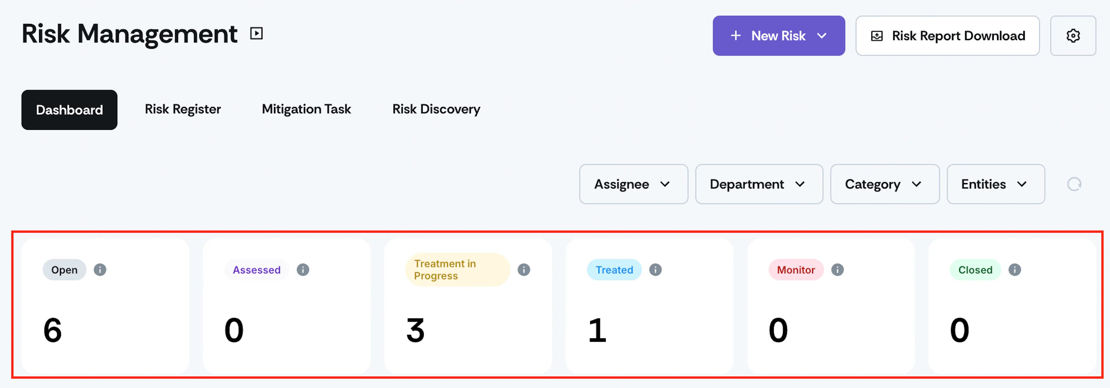
Risk Metrics Cards
The Risk Metrics cards help track important metrics by displaying them at the top of the page.
Risk Heat Map
The Risk Heat Map offers a visual representation of risks, enabling users to quickly assess and prioritize them based on severity and potential impact. This helps decision-makers identify areas where additional resources may be needed.
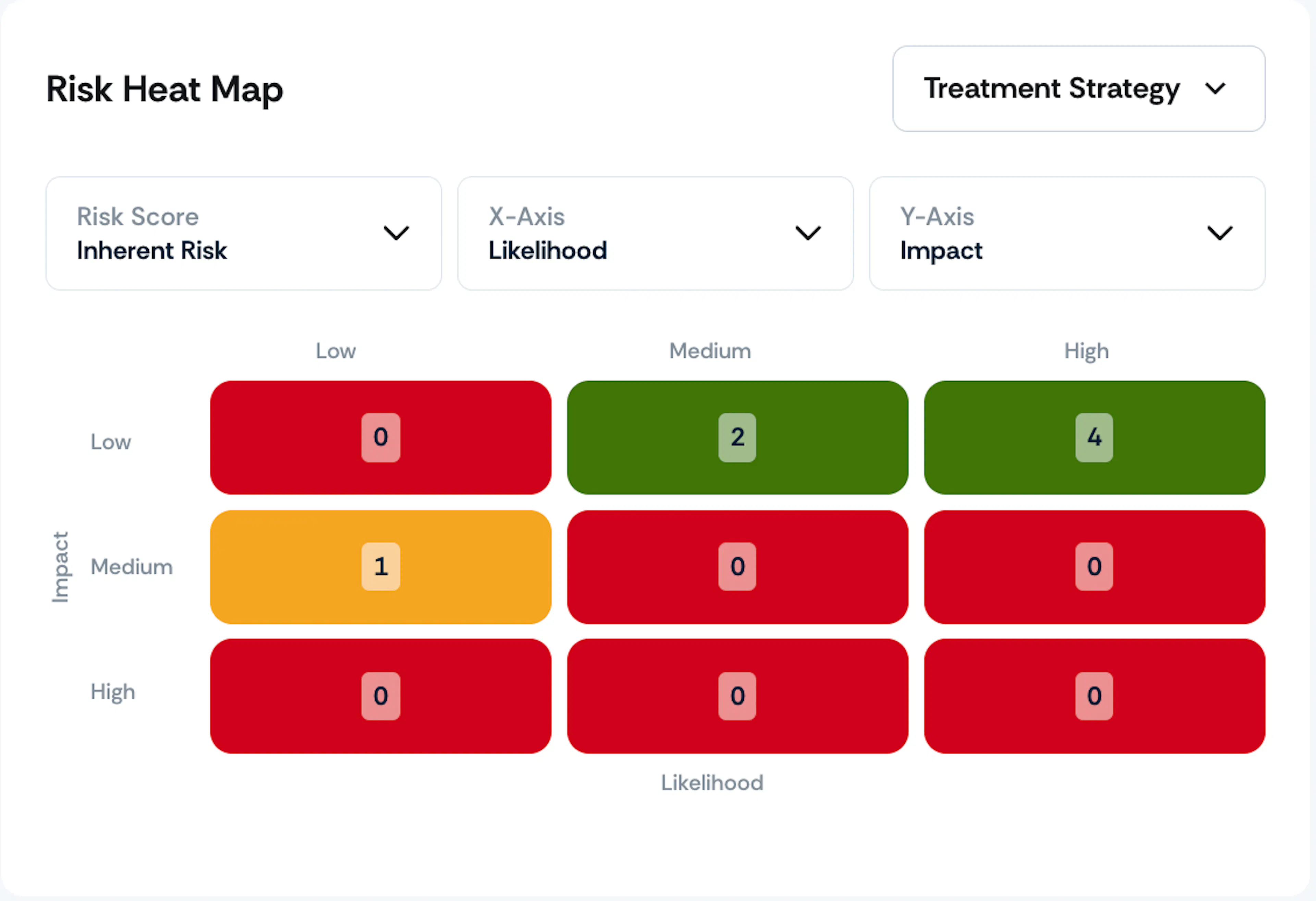
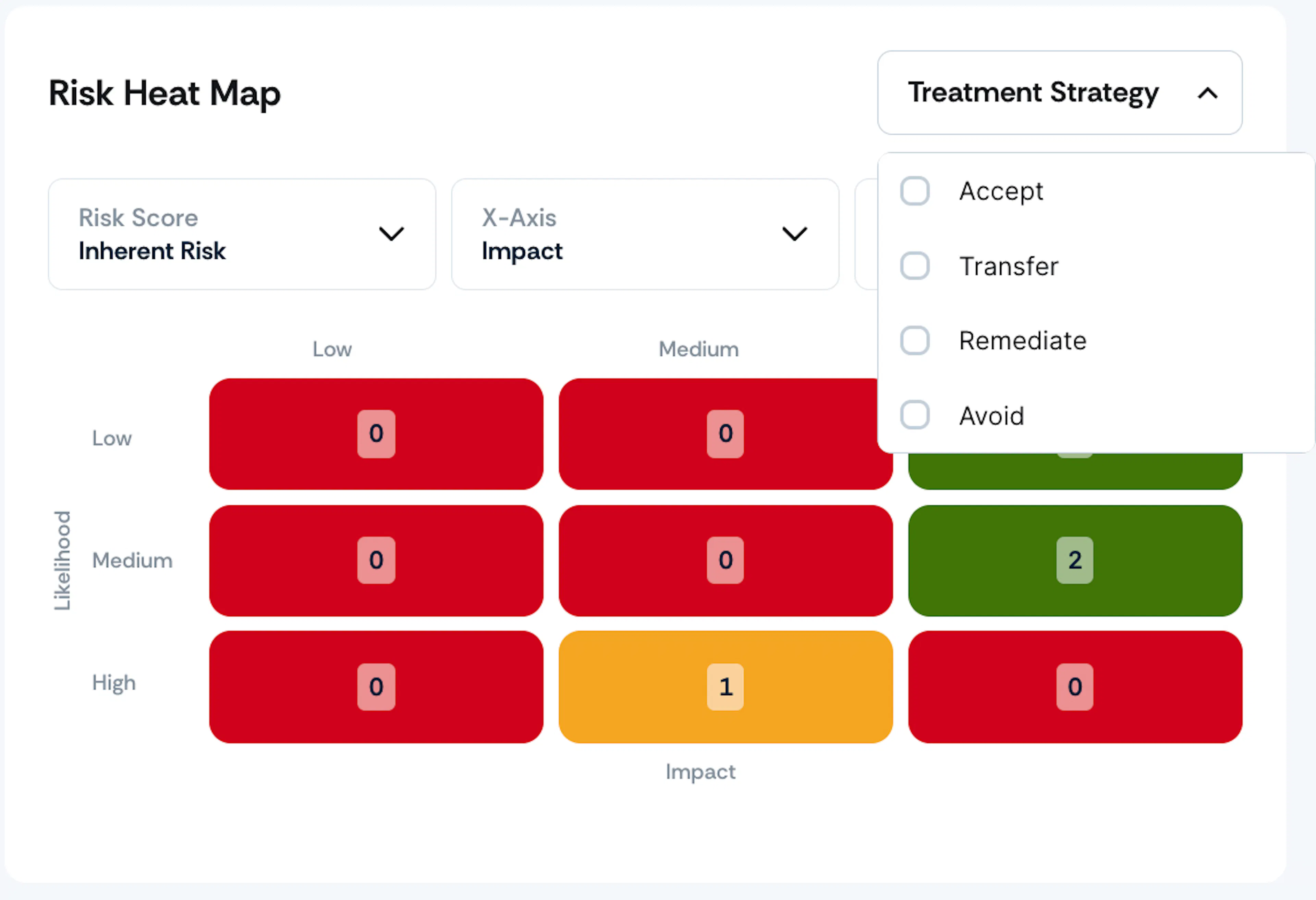
You can generate Risk Heat Maps using any Inherent and Residual Risk formula of your choice. Customize the X and Y-axes assignments to fit your preferences. Additionally, the Risk Heat Map includes a Treatment Strategy filter, enabling you to drill down based on treatment strategies.
Risk Trend Graph
Who can use this feature
- Supported on Growth and Scale plans
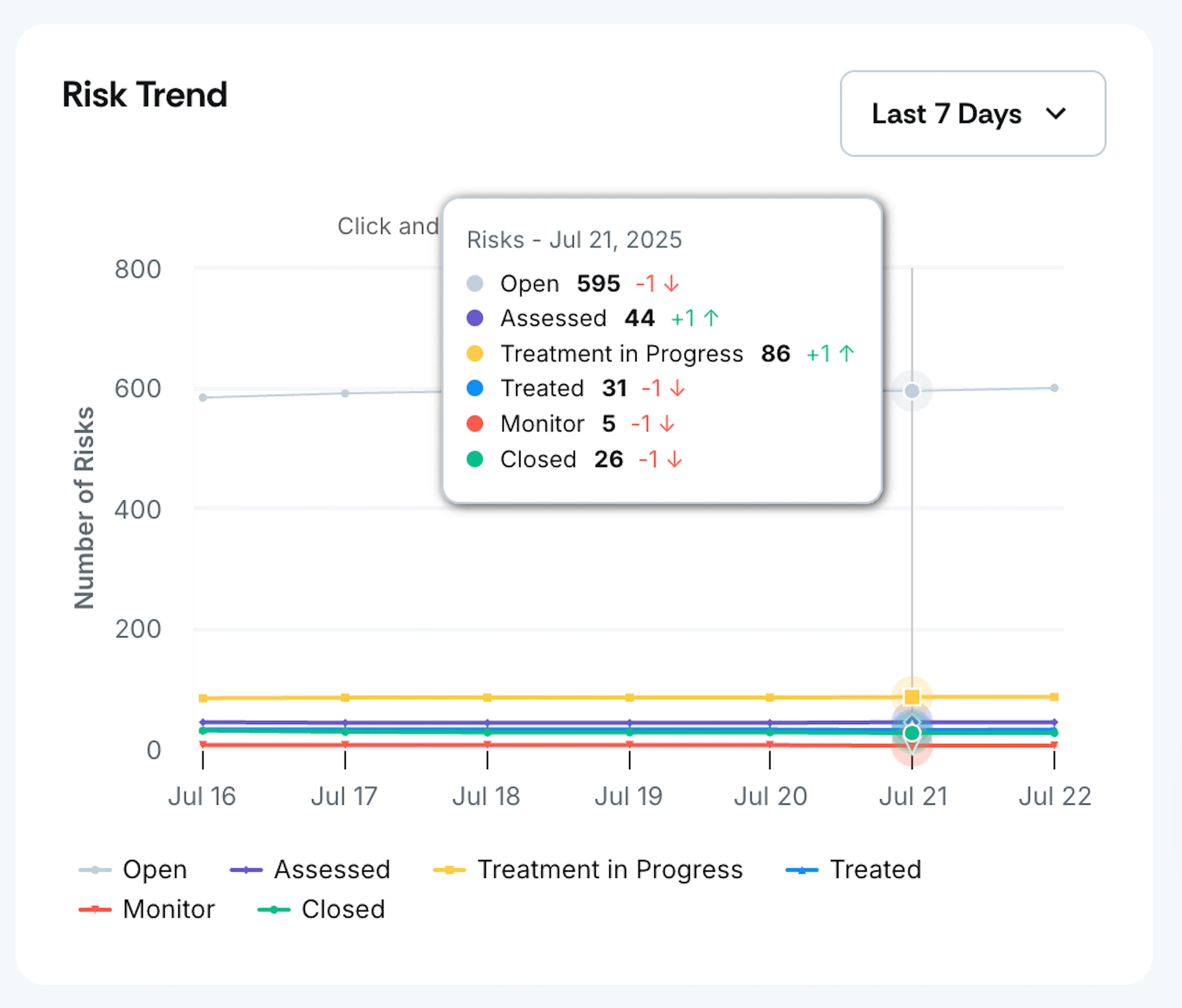
- Tracks the number of risks across all statuses over time.
- Filter by the last 7, 30, or 90 days, or a custom range.
- View data in daily, weekly, or monthly aggregation.
Important
The Risk Trend graph will continue to display organization-wide data and is not affected by the entity filter at the top of the dashboard.
Note:
Check this guide for a detailed explanation of the data shown in the Risk Trend graph and how it works.
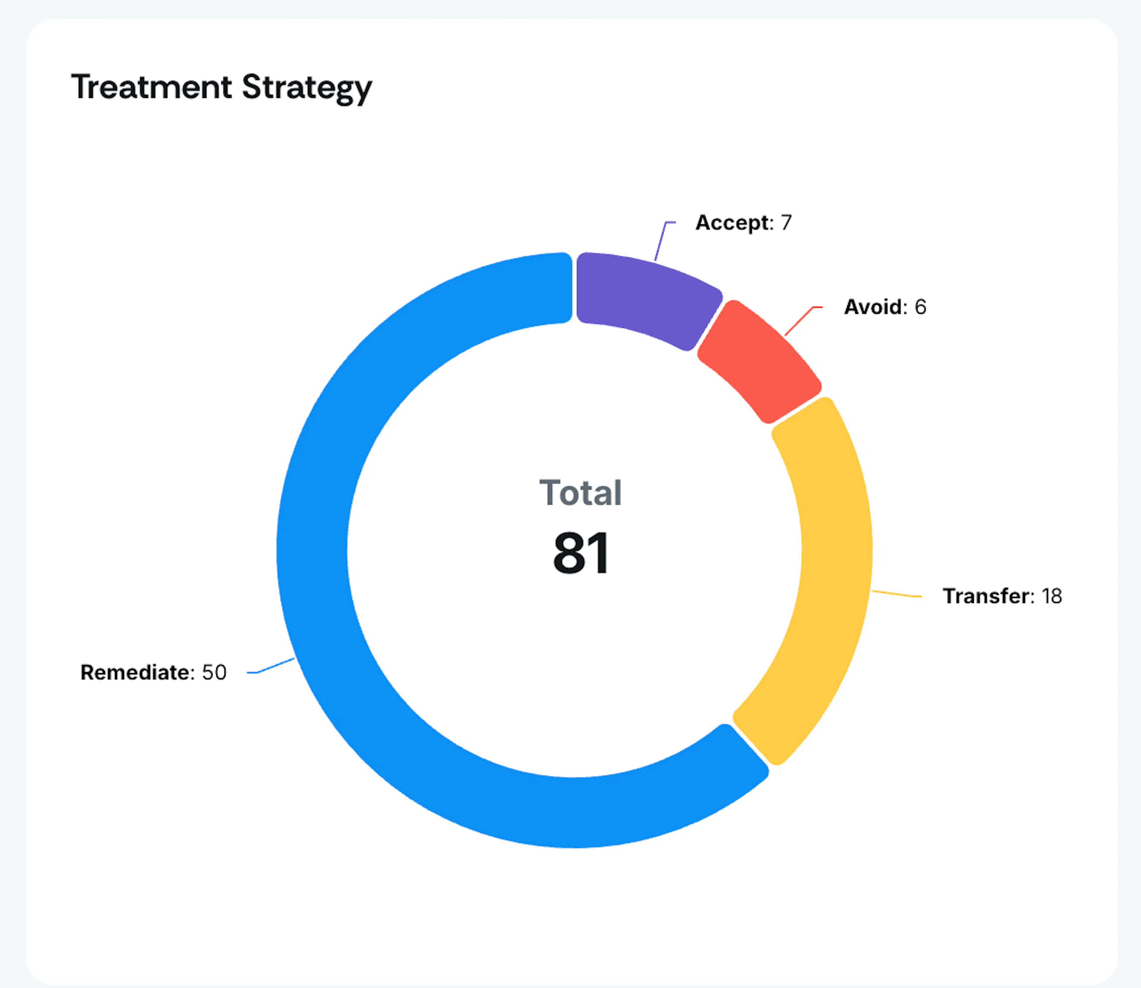
Treatment Strategy Distribution Chart
Note: The earlier Risk Aging graph has been replaced with a doughnut chart that displays the distribution of treatment strategies.
This chart is interactive. Click on it to view filtered risks by treatment strategy.
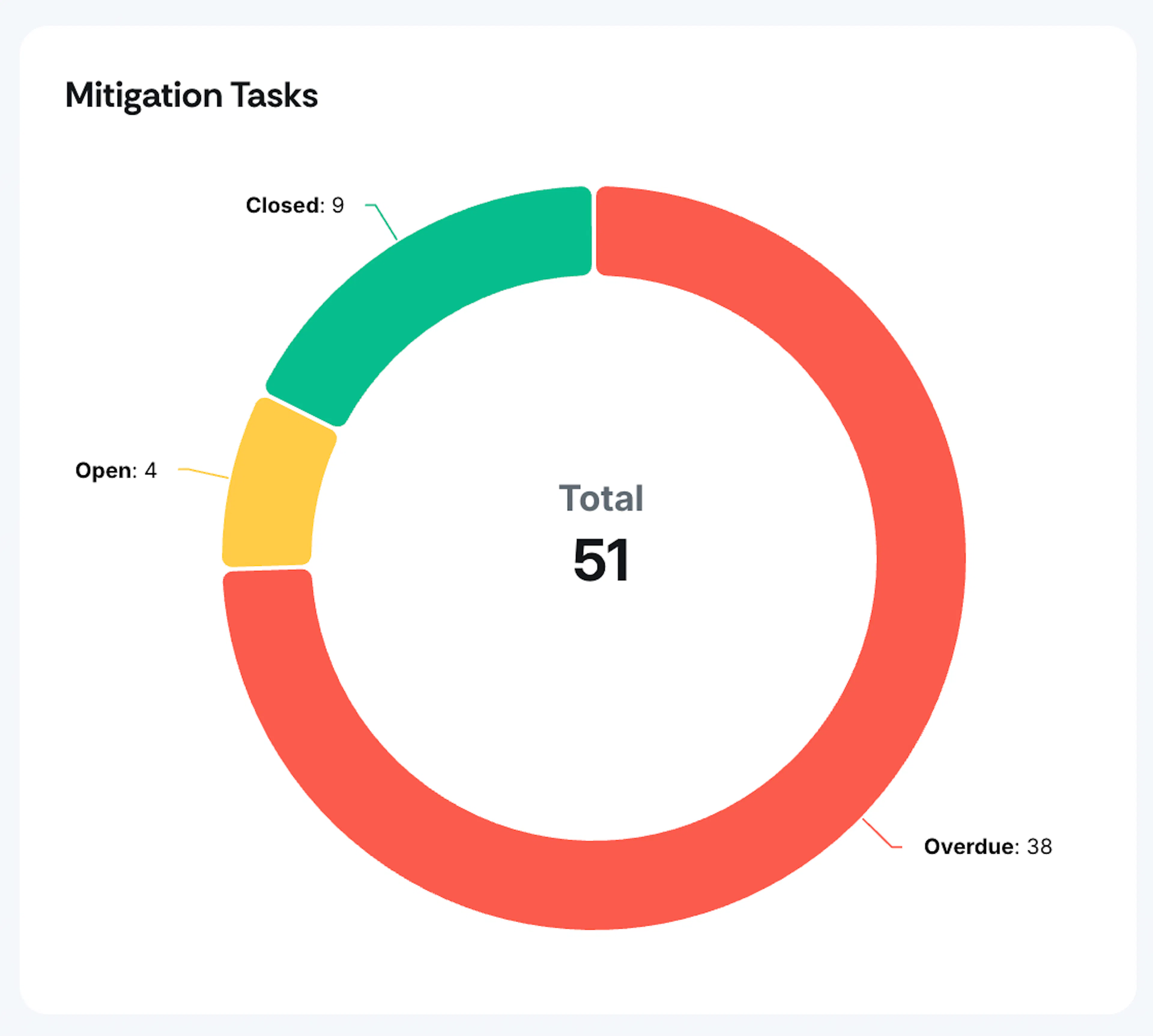
Mitigation Tasks Chart
The graph visualizes the counts of Overdue, Closed, and Open Mitigation tasks using a donut chart.
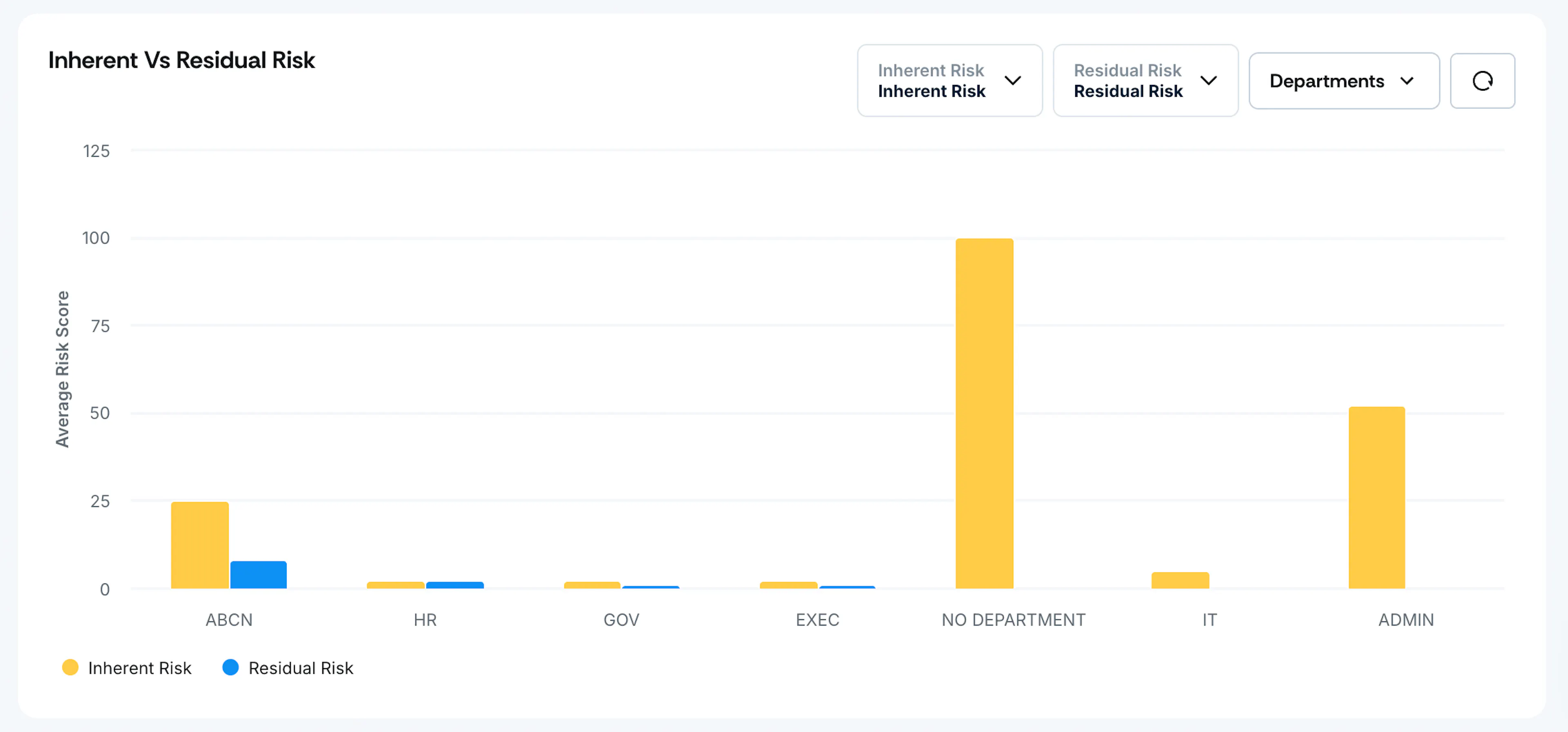
Inherent vs Residual Risk
A visual graph providing a clear and concise comparison of Inherent and Residual Risks categorized by various departments. This graph specifically highlights risks that have the status “Treated,” allowing for a better understanding of how risks have been managed and mitigated within each department.
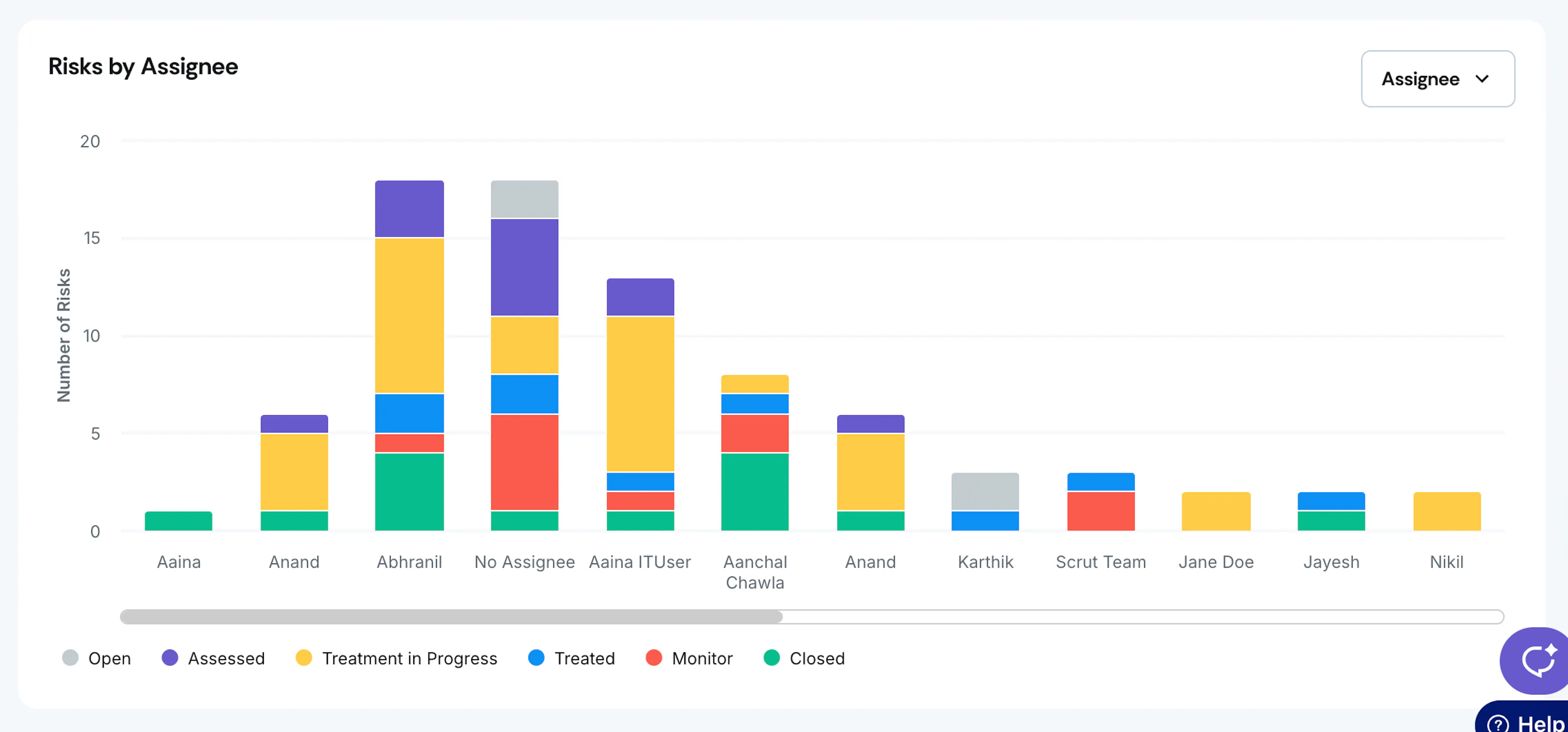
Risks By Assignee
The graph helps in understanding the number of risks assigned to individuals, categorized into four distinct statuses. Click on a color segment to navigate to the risk register, where you can view a detailed list of all associated risks.
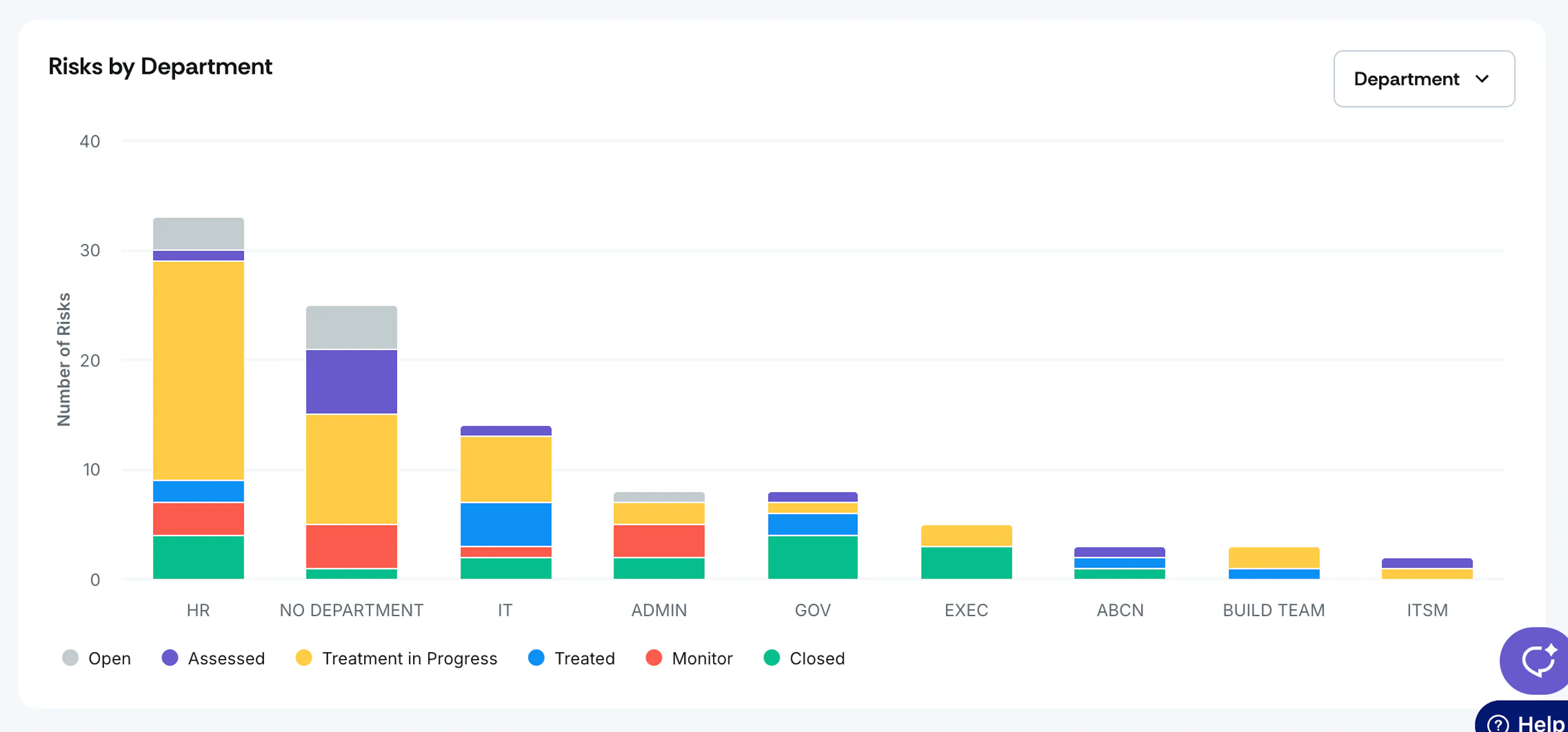
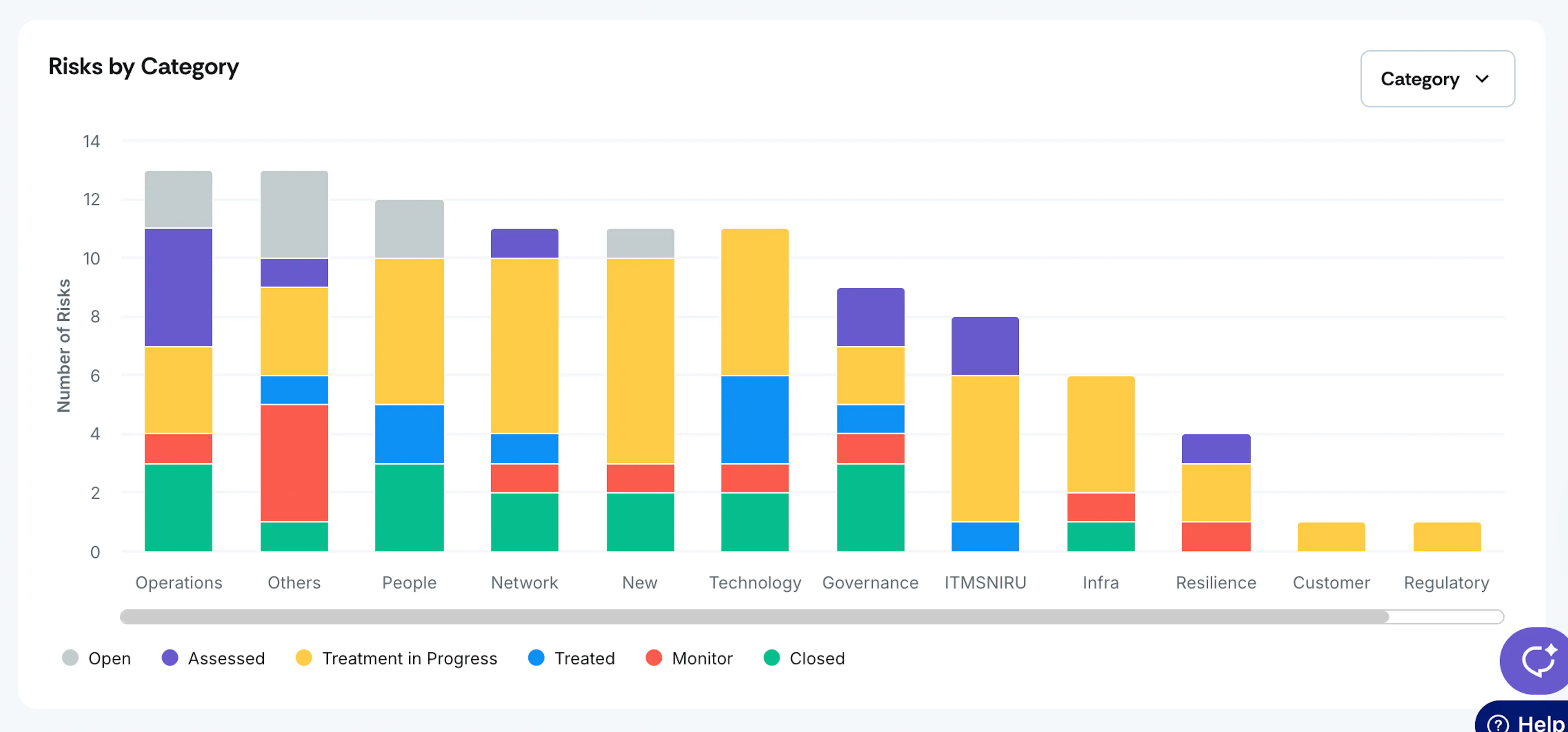
Risks By Category / Department
The graph makes it easy to visualize the number of risks categorized by department or category and their corresponding statuses. Click on a color stack to navigate to the risk register, which provides a comprehensive list of all associated risks.