

Understand the Risk Trend Graph
Who can use this feature
- Supported on Growth and Scale plans
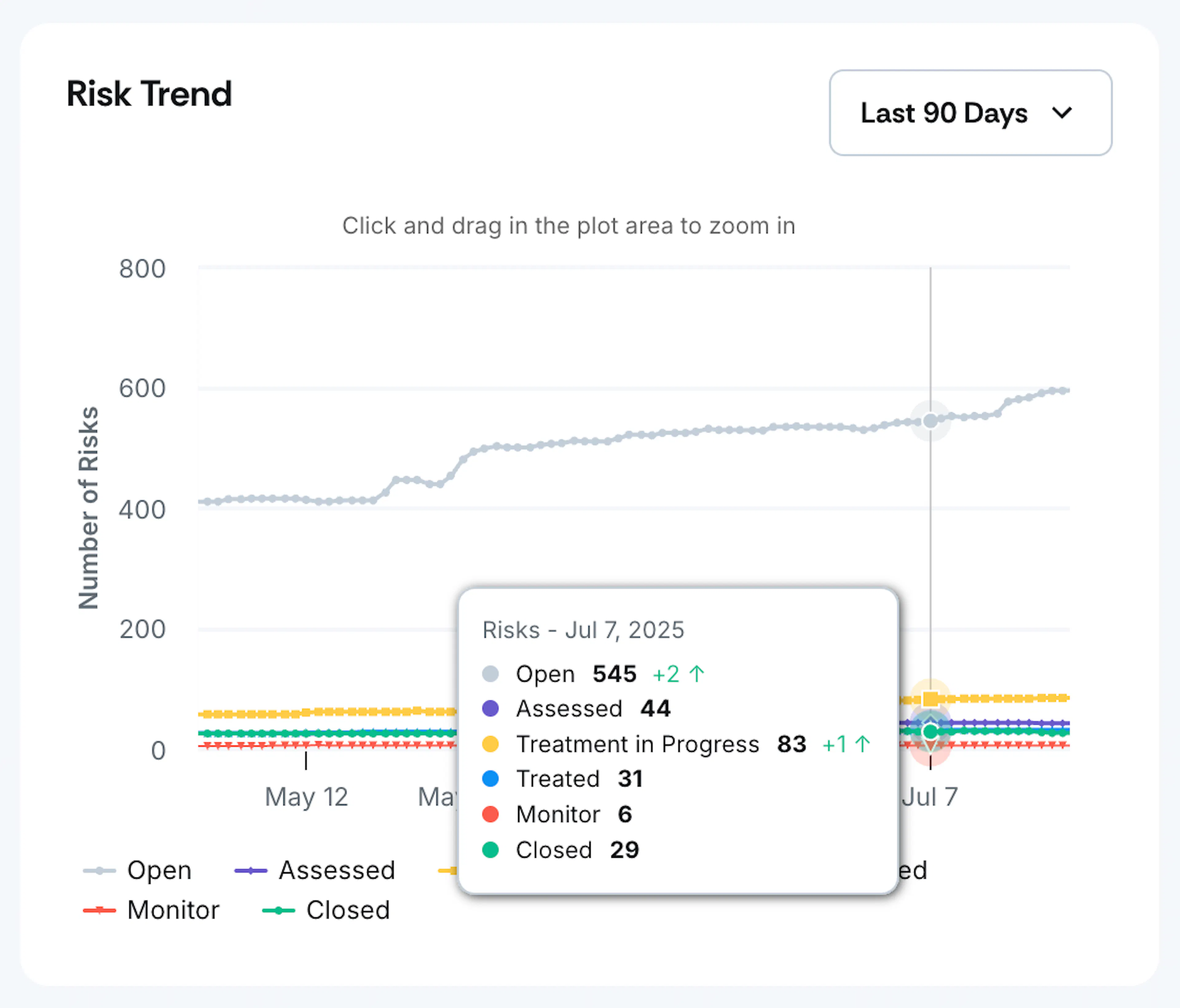
The Risk Trend Graph in the Risk Dashboard provides a comprehensive visual representation of how your organization’s risks evolve over time across different statuses. This dynamic chart tracks the journey of risks through their complete lifecycle, giving you insights into risk management effectiveness and organizational risk posture trends.
How It Works
Risk Lifecycle Tracking
The Risk Trend Graph tracks risks through six distinct statuses in their lifecycle:
- Open: Risk created, no assessment done yet
- Assessed: Inherent risk added or inherent risk + controls linked
- Treatment in Progress: Treatment strategy added
- Treated: Residual risk added
- Monitored: Risk is tagged for future tracking
- Closed: Risk is no longer relevant (includes closure reason)
Data Captured
The Risk Trend Graph uses status transition timestamps to provide accurate historical data:
- Status Change Tracking: Whenever a risk's status changes, the graph captures the exact date of the change. It also tracks whether the number of risks in each status has increased or decreased compared to the previous day.
- Historical Accuracy: This allows the graph to display the actual number of risks in each status on any given date in the past.
- Real-time Updates: The graph updates automatically as risks transition between statuses.
Using the Risk Trend Graph
Date Range Filters
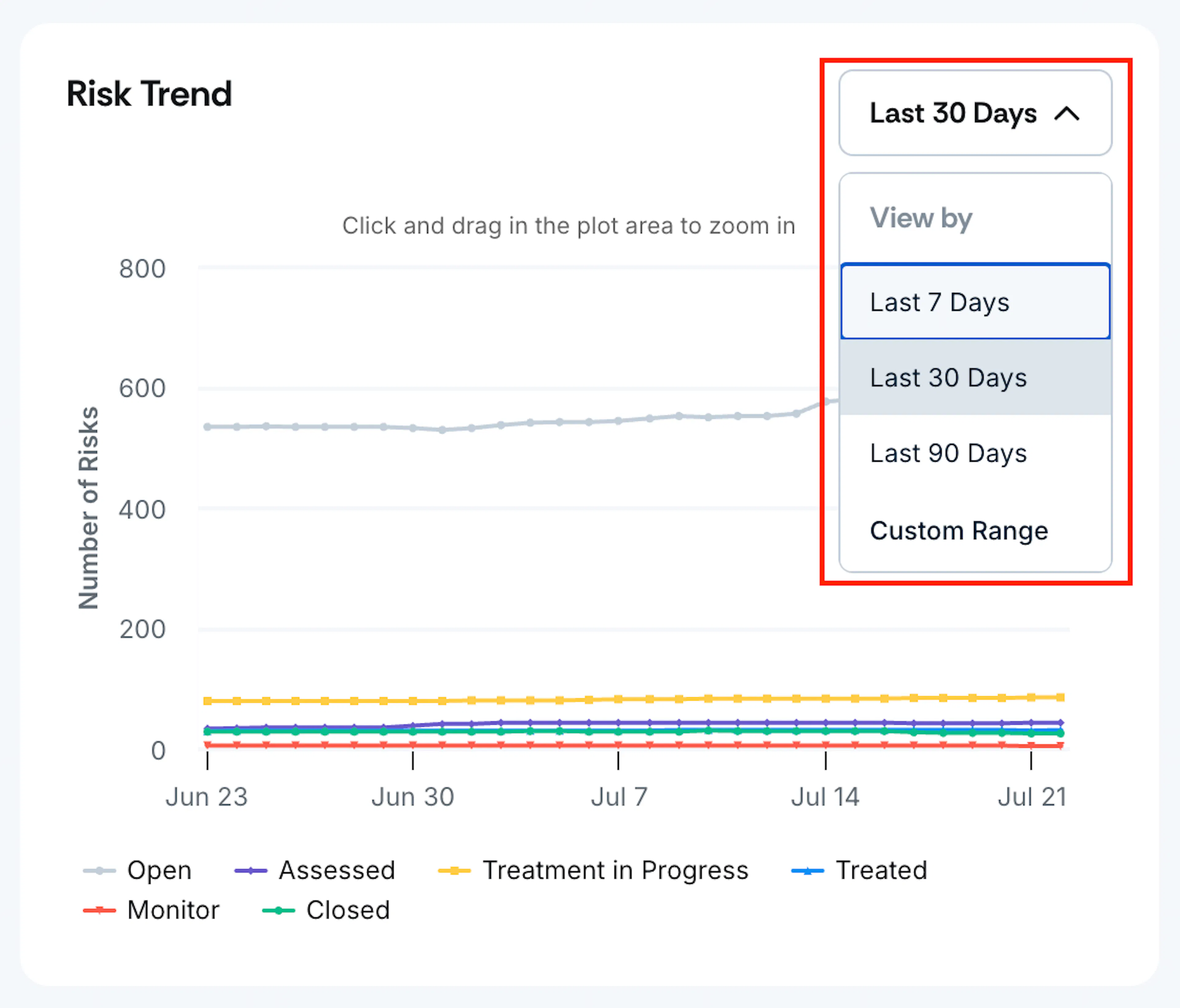
You can customize the period displayed on the graph using these filter options:
- Last 7 days: To monitor recent short-term trends
- Last 30 days: To monitor monthly risk management patterns
- Last 90 days: For quarterly risk lifecycle analysis
- Custom Date Range: Specify exact start and end dates for tailored reporting
Pro Tip!
Click and drag the plot area to zoom in on the graph.
Interactive Tooltips
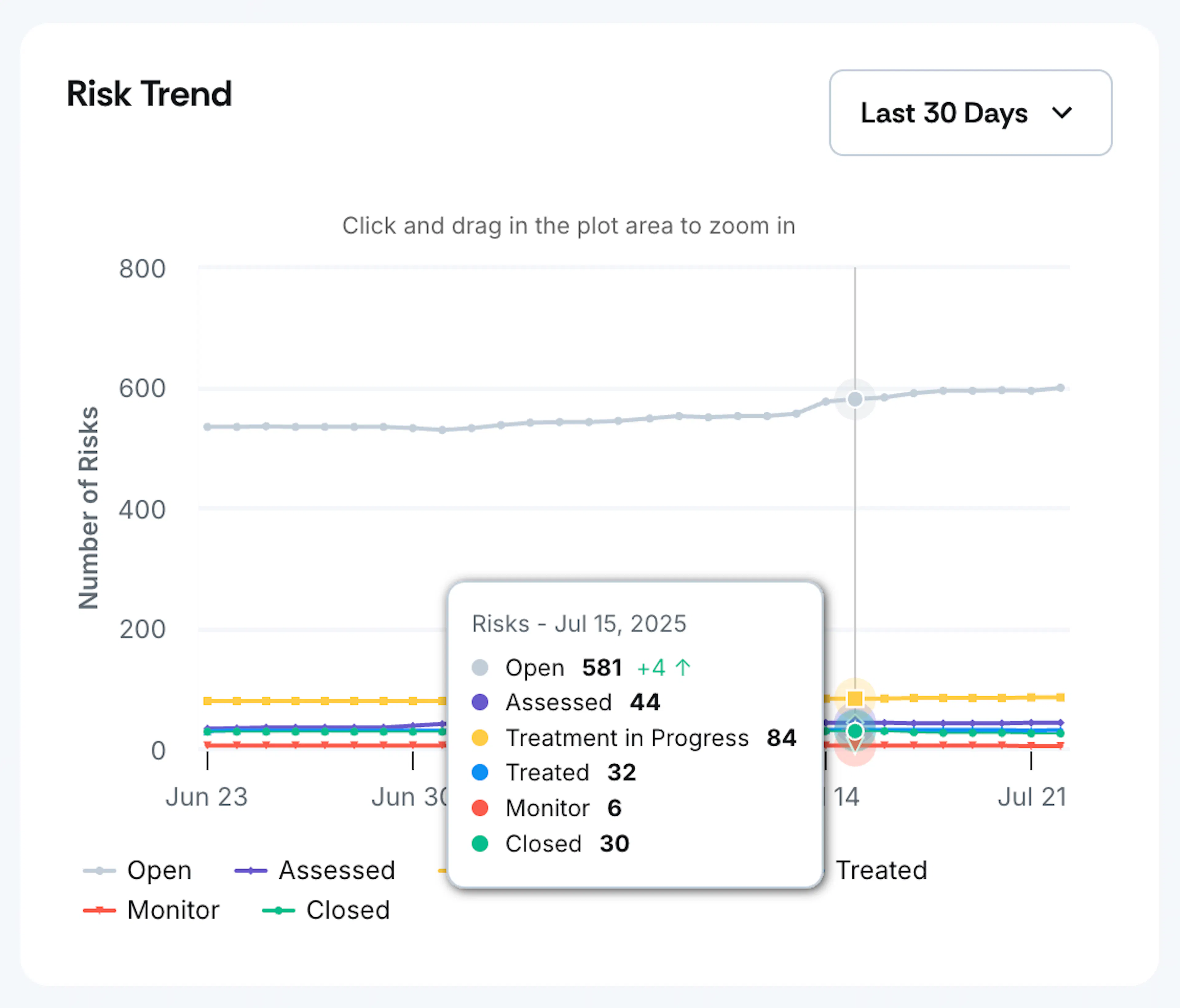
Hover any point on the graph to see detailed information on:
- Risk count per status on that specific date
- Net change compared to the previous day (with directional indicators)
Tips on Interpreting the Risk Trend Graph
Here are a few tips to help you understand the graph and gain a clearer picture of your risk landscape:
- Upward trends in “Assessed”: Indicates active risk identification and evaluation
- Growth in “Treatment in Progress”: Shows proactive risk mitigation efforts
- Increases in “Treated”: Demonstrates successful risk remediation
- Increases in “Closed”: Shows successful resolution of outdated or mitigated tasks
- Smooth progression curves: Indicate well-managed risk workflows
- Bottlenecks: Flat lines or accumulation in specific statuses may indicate process delays
- Rapid status changes: Could suggest either effective risk management or potential issues
Best Practices
- Review the graph weekly to identify trends and bottlenecks
- Use different date ranges to monitor short-term activities and understand long-term patterns
- Compare current periods with historical data to measure improvement
Notes
- Historical data is preserved even if risks are deleted or archived
- Status transition timestamps are immutable once recorded, ensuring data integrity
- Scrut maintains a complete audit trail of all risk status changes