

Understand the Compliance Dashboard
Who can use this feature
- Supported on Foundation, Growth, and Scale plans
The compliance dashboard in Scrut provides an overview of your organization’s compliance status. It helps you monitor your compliance progress, analyze compliance trends over time, track upcoming audits, identify tasks that require your attention, and view key metrics at a glance. This guide will walk you through each dashboard component and explain how to use it effectively.
Accessing the Dashboard
To access the compliance dashboard:
- Log in to Scrut using your credentials.
- Click Dashboard on the left navigation panel.
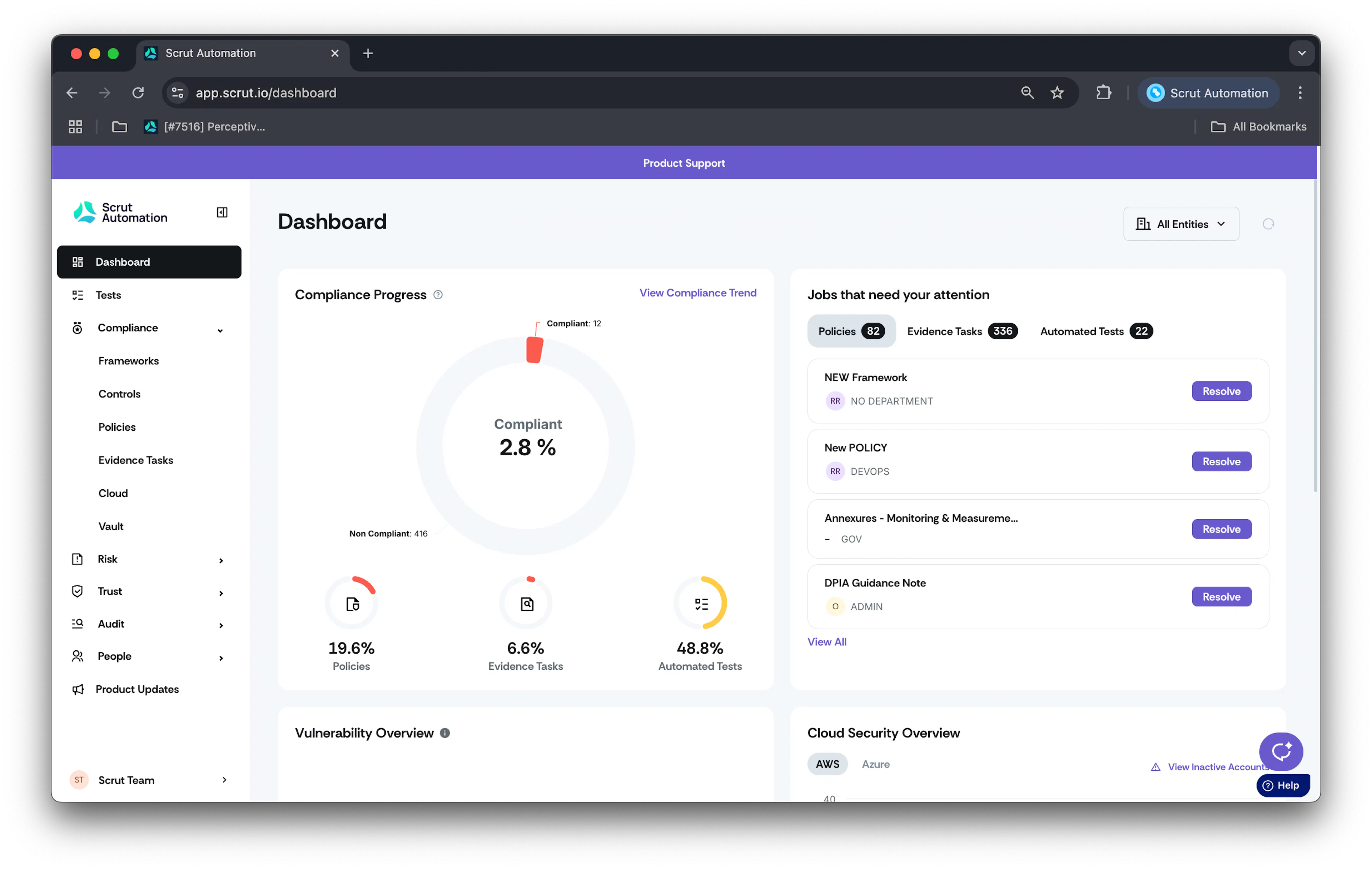
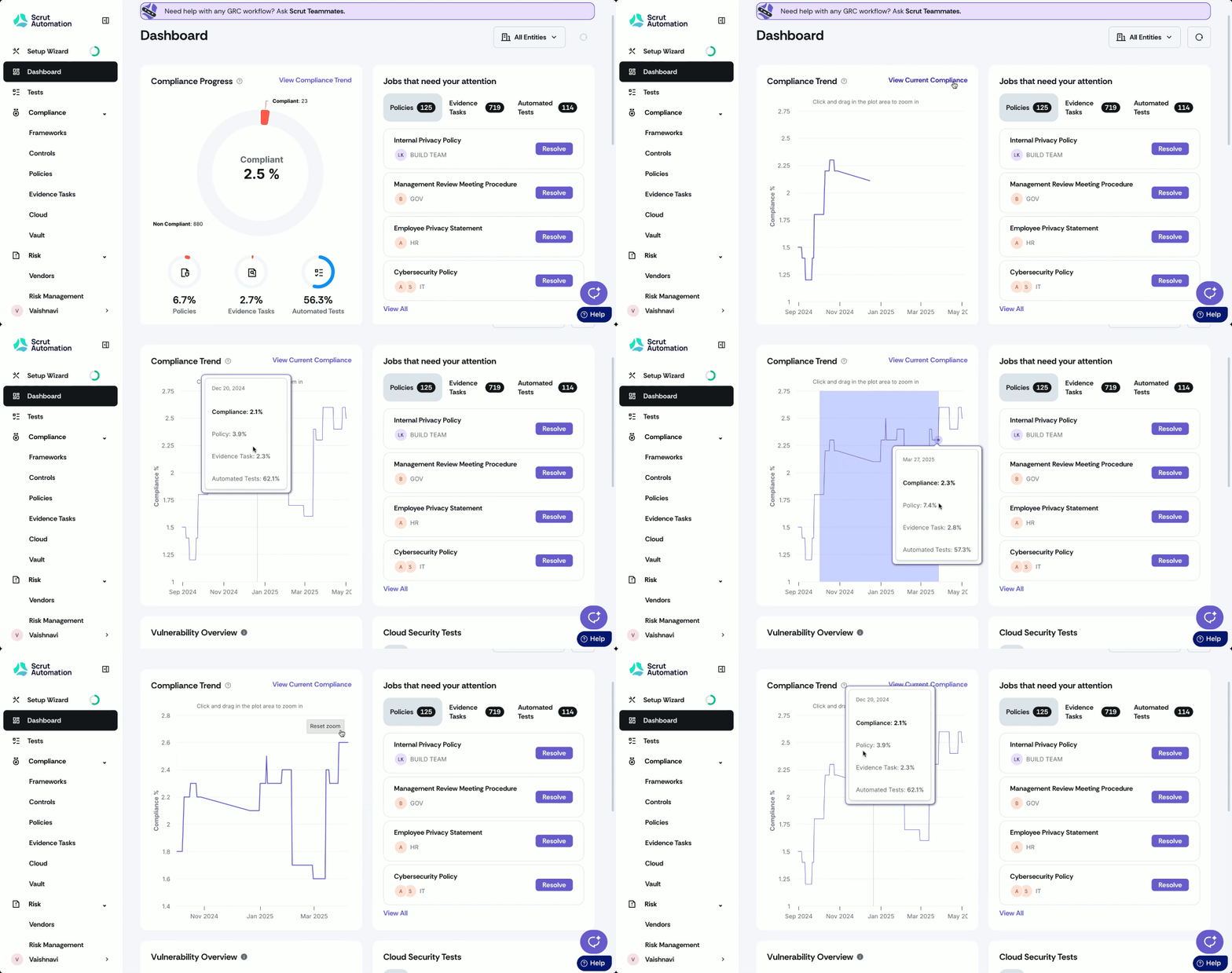
Compliance Progress
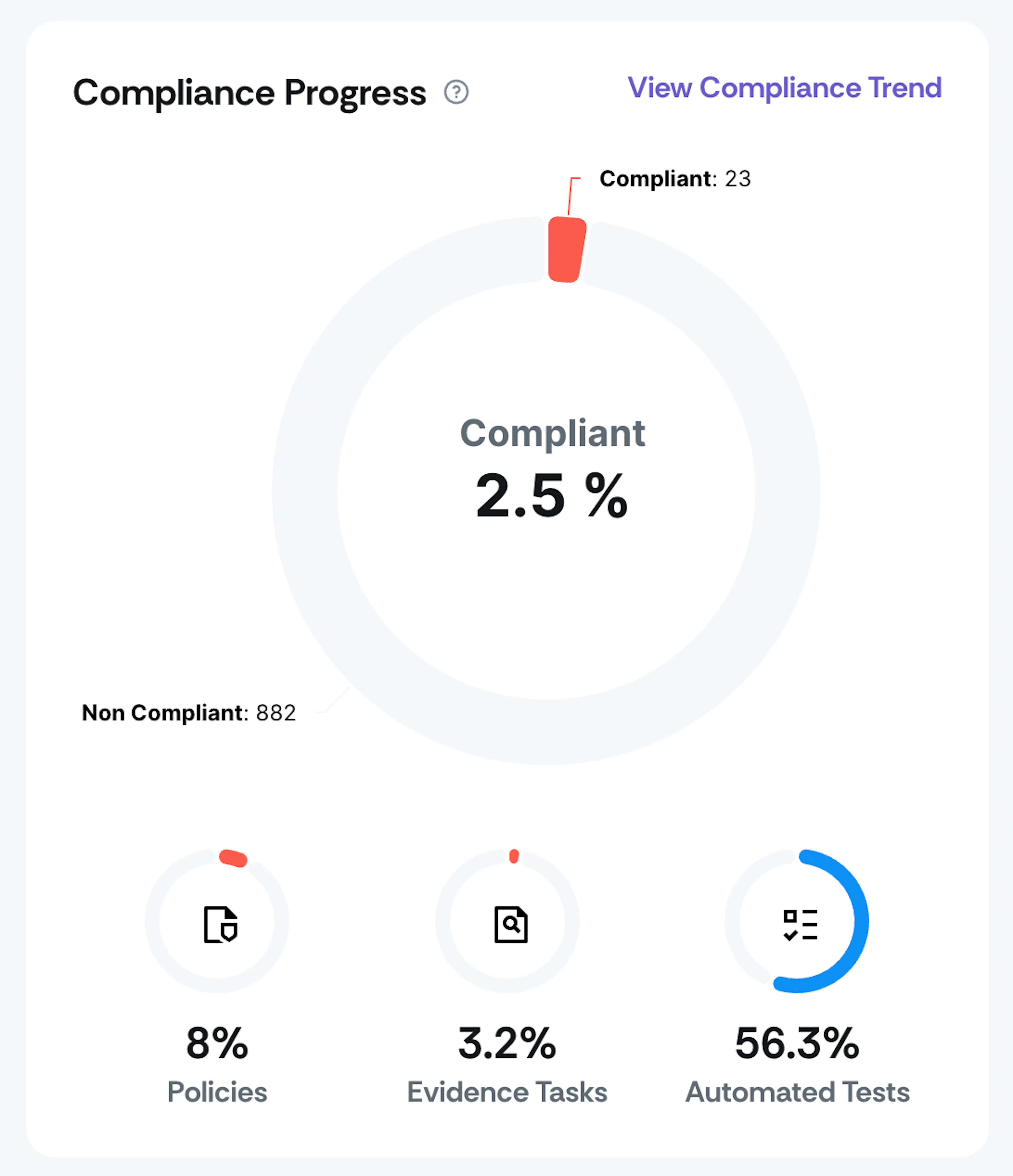
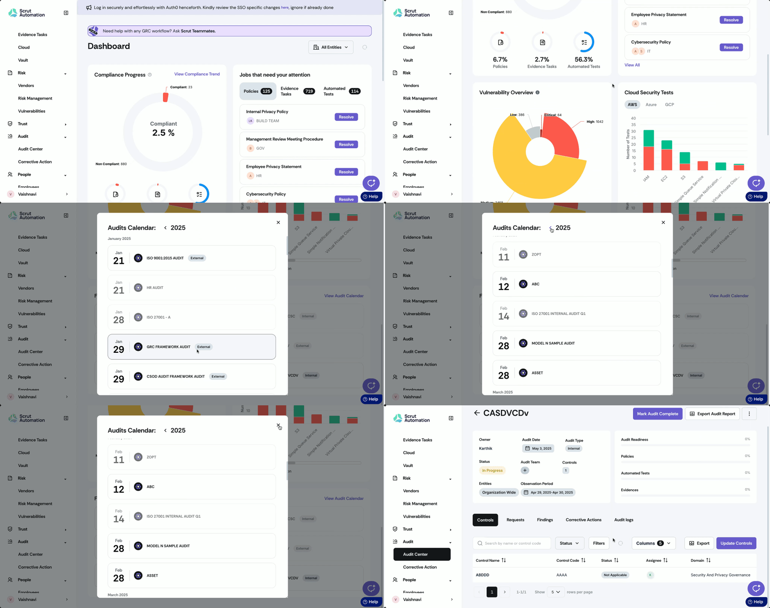
This chart shows your overall compliance status as a percentage. The Compliance Progress card also includes the compliance percentage of each component:
- Policies (%): Percentage of published policies
- Evidence Tasks (%): Percentage of evidence uploaded
- Automated Tests (%): Percentage of automated tests that are compliant
Understanding Compliance Calculations
Compliance
The compliance progress indicates the overall compliance status of your organization. The higher the percentage, the more compliant your organization is.
Compliance Percentage = (No. of compliance controls / Total no. of controls) * 100
Note: Controls marked as “Not in Scope” or “Not Applicable” are excluded from this calculation. Additionally, policies linked to “Not Applicable” controls are also omitted from this calculation.
Policies
This metric shows the percentage of published policies. The higher the number, the more comprehensive your policy documentation will be.
Policies Percentage = (No. of policies published / Total no. of policies) * 100
Note: Policies marked as “Not Relevant” are excluded from this calculation. Additionally, evidence tasks attached to “Not Applicable” controls are also omitted from this calculation.
Evidence Tasks
This metric indicates the percentage of uploaded evidence tasks. The higher the number, the more proactive your organization has been in providing relevant evidence for implementing necessary controls and measures.
Evidence Tasks Percentage = (No. of evidence tasks uploaded / Total no. of evidence tasks) * 100
Note: Evidence marked as “Not Relevant” are excluded from this calculation. Additionally, tests associated with “Not Applicable” controls are also omitted from this calculation.
Automated Tests
This metric indicates the percentage of automated test findings that are compliant with relevant standards. The higher the number, the more secure and compliant your cloud infrastructure and other applications are.
Automated Tests Percentage = (No. of compliant automated tests / Total no. of automated tests) * 100
Note: Tests marked as “Ignored” are excluded from this calculation.
Compliance Trend
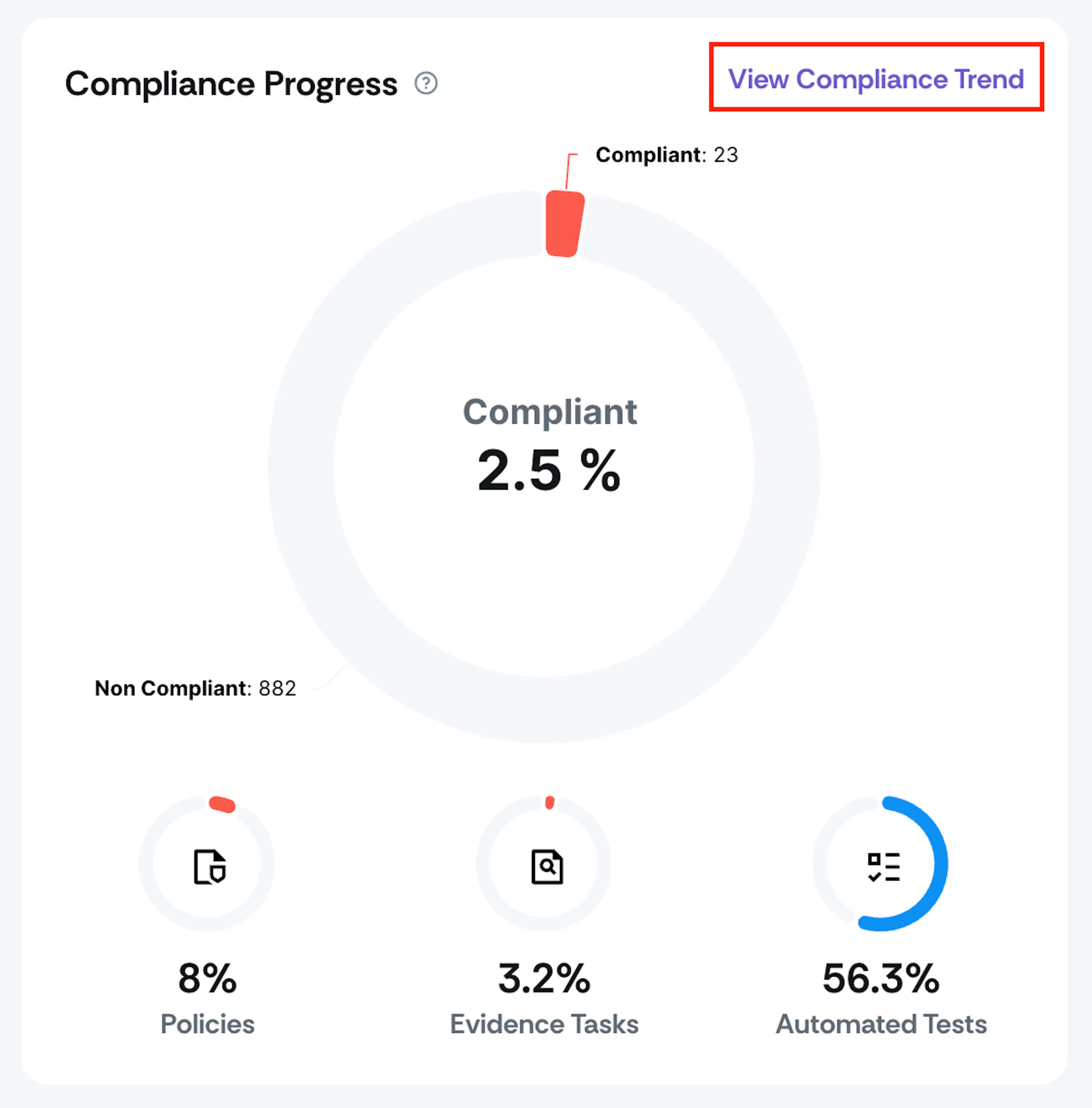
Click the View Compliance Trend button in the Compliance Progress chart to view your historical compliance data.
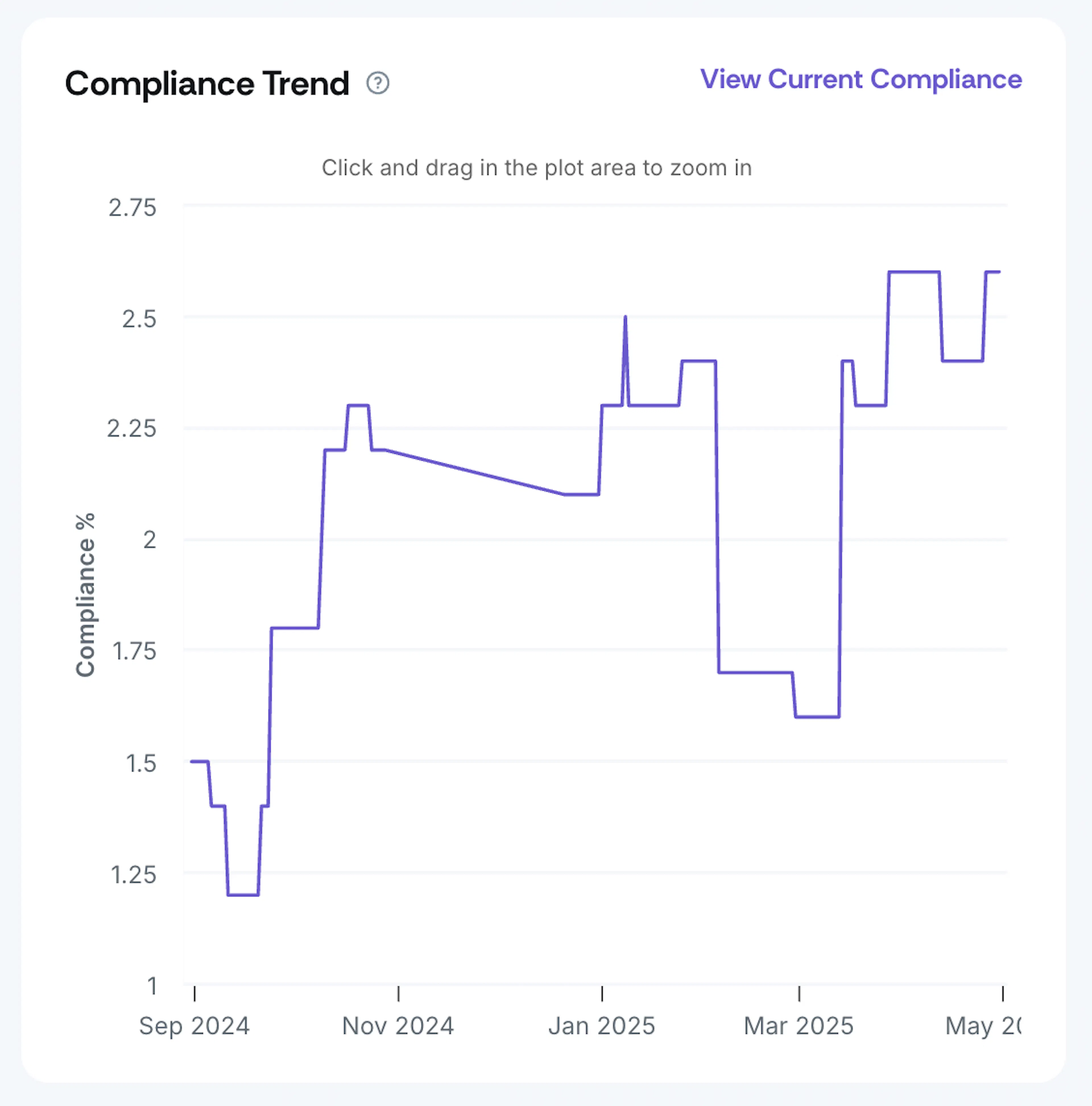
- Click and drag the plot area to zoom in.
- Click Reset Zoom to zoom out.
- Hover over any point to view the compliance percentages for a specific day.
Jobs That Need Your Attention
This section highlights tasks that require immediate action:
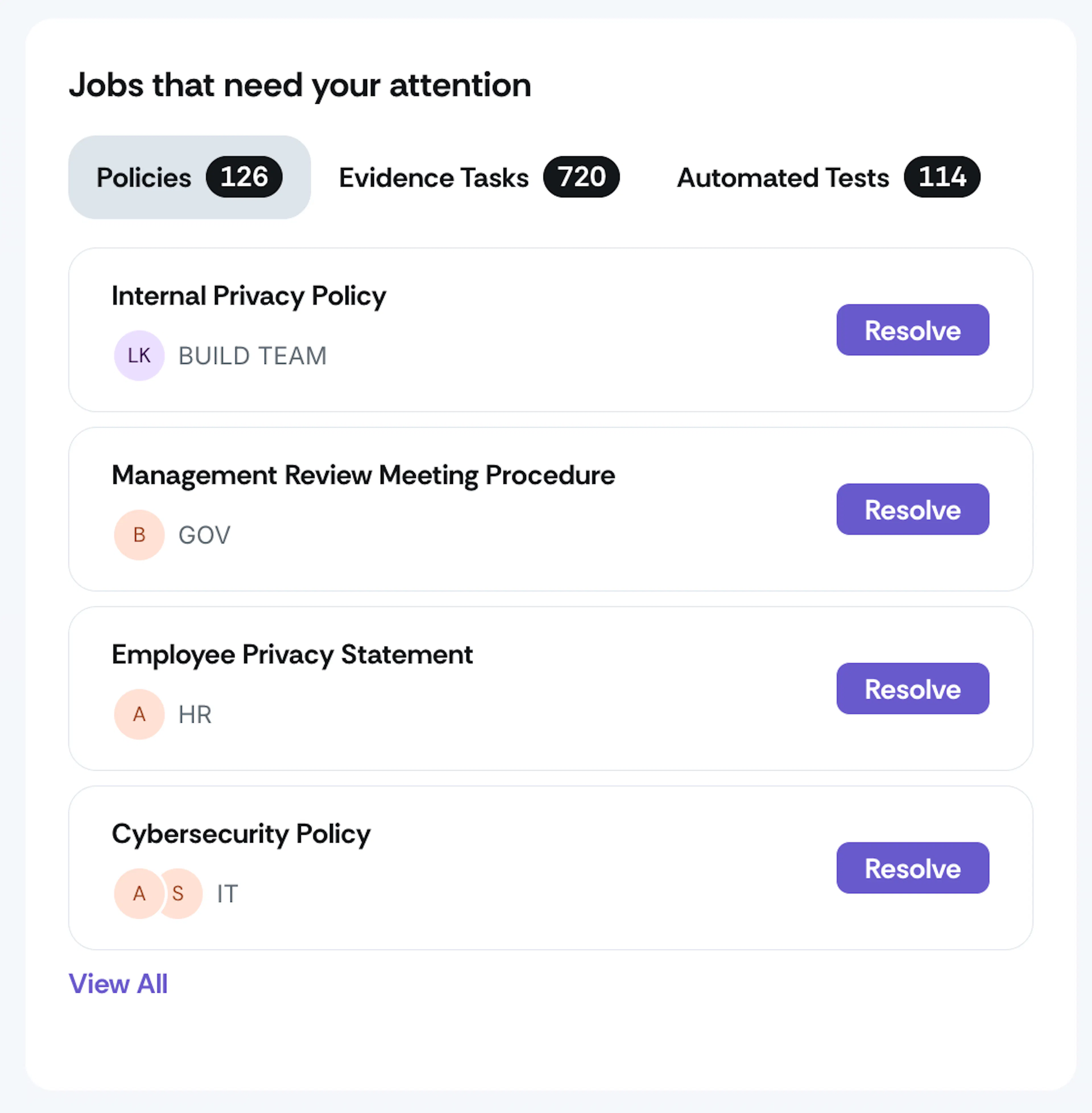
It includes:
- Policies: It lists policies in statuses such as Not Uploaded, Draft, Approved, or Needs Review.
- Evidence Tasks: It lists evidence items with statuses such as Not Uploaded, Draft, or Needs Attention.
- Automated Tests: Tests with the Fix Required status.
Each category shows the total number of tasks that you need to resolve. Below this summary, you can see the individual item name, department/team, and assignees. Clicking the Resolve button next to an item takes you directly to the artifact’s page. Click the View All button to see the complete list of items under each section.
Vulnerabilities Overview
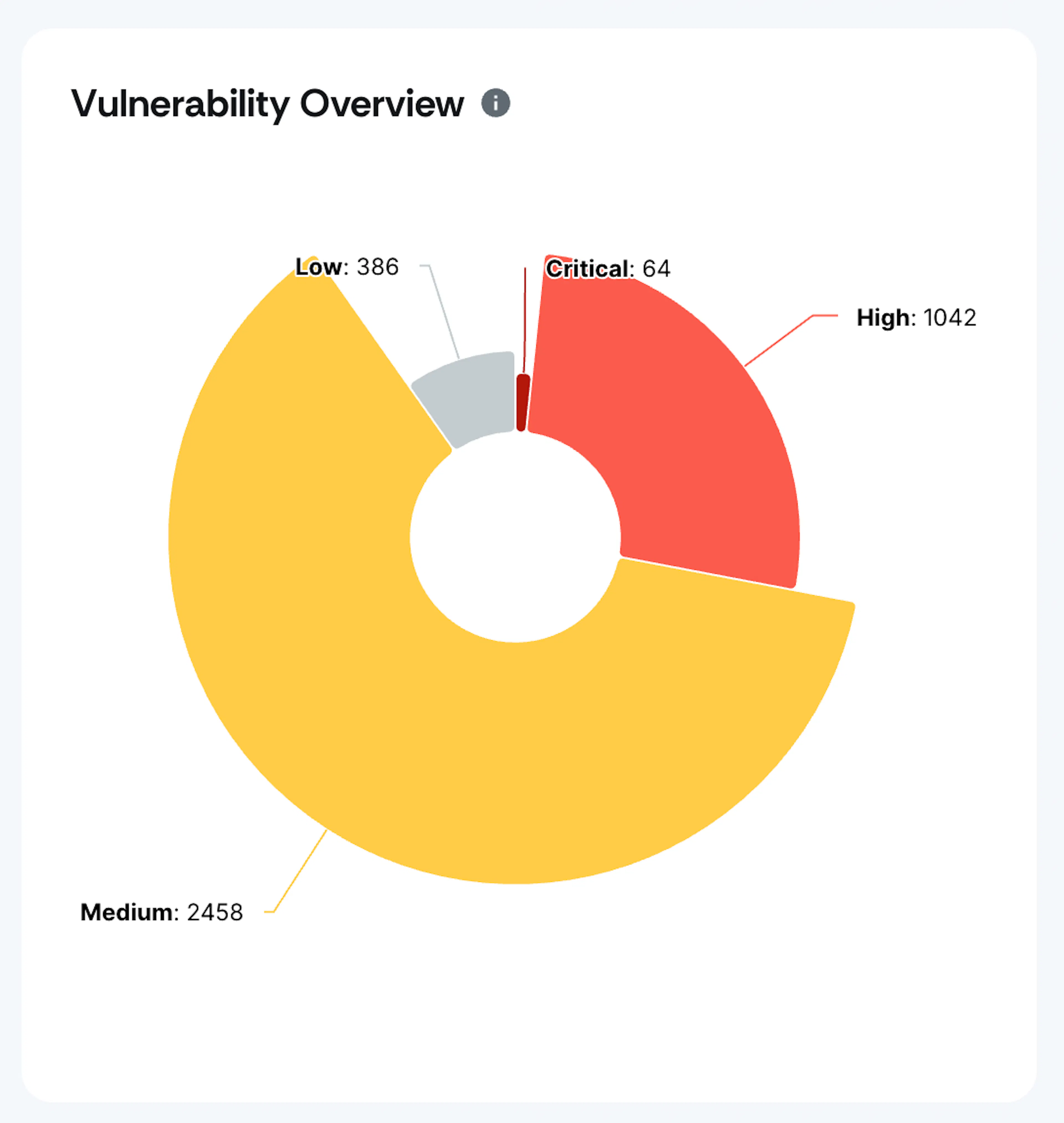
This chart provides a quick assessment of your security posture through a donut chart that illustrates the distribution of vulnerabilities. It highlights vulnerabilities across different risk categories and includes those with the following statuses: open, acknowledged, and risk. This chart helps your security team prioritize remediation efforts by focusing on critical and high vulnerabilities while maintaining awareness of the overall vulnerability burden.
Clicking on any part of the donut chart takes you to the Vulnerability module with relevant filters applied. For instance, selecting the high-risk portion of the chart allows for a quick and efficient review of vulnerabilities categorized as High severity.
Cloud Security Overview
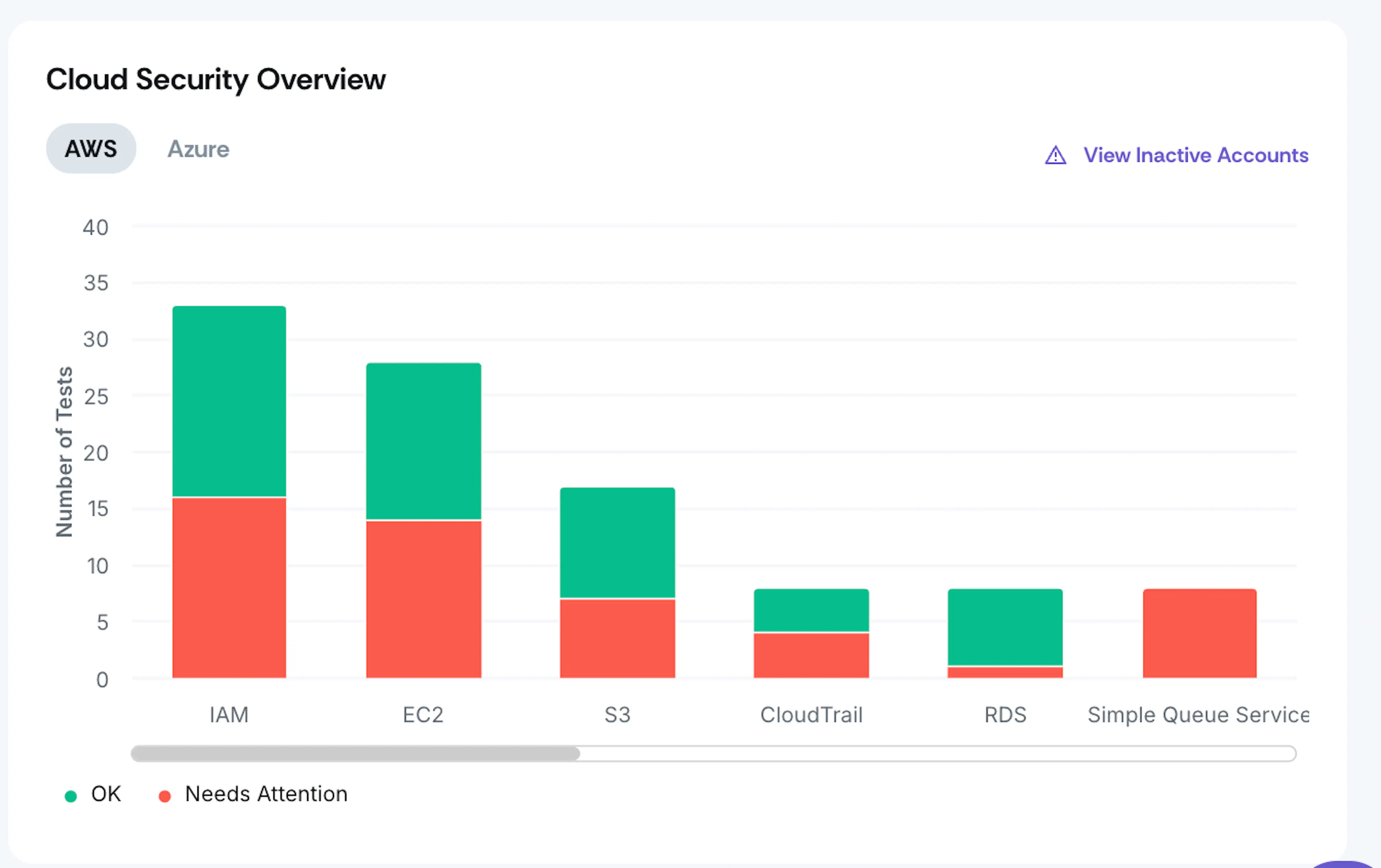
This chart helps users quickly assess the security status of their AWS, Azure, and GCP infrastructure. It shows an intuitive stacked bar visualization that makes it easy to identify the number of tests passed successfully or failed. You can toggle between the three cloud providers using the tabs at the top to drill down into specific cloud environments. The chart is clickable, and clicking on any section takes you to the cloud module with relevant filters applied.
Frameworks
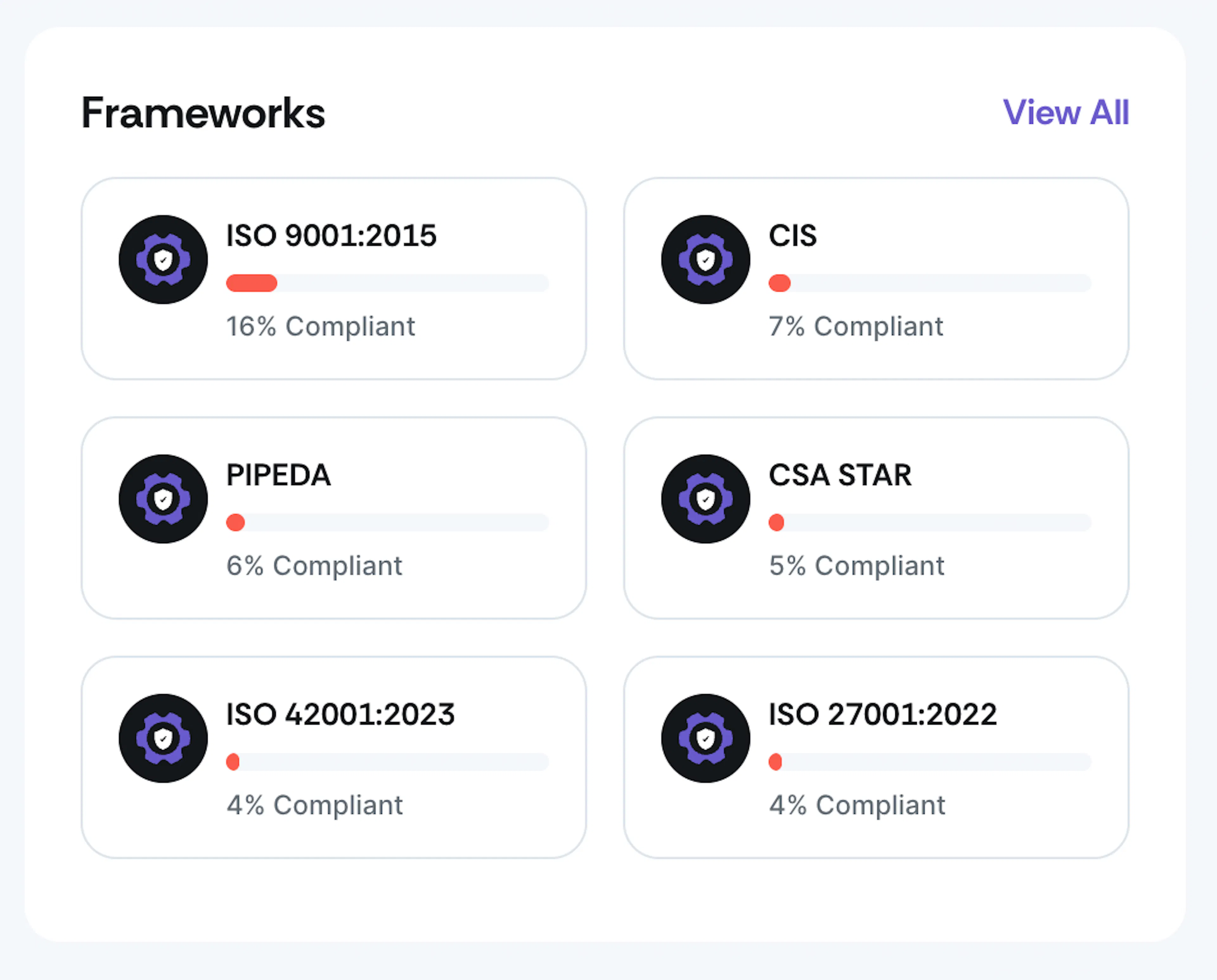
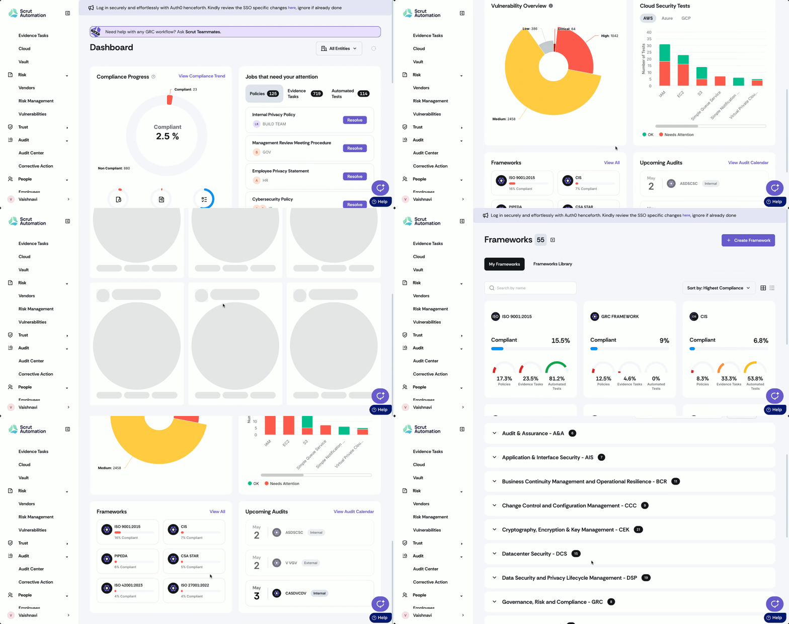
The Frameworks section shows your compliance status across different frameworks. For each framework, you can see:
- Framework name
- Visual indicator of compliance level
- Compliance percentage
Click View All to access detailed information about all frameworks. Click on a specific framework to go directly to the corresponding framework page.
Upcoming Audits
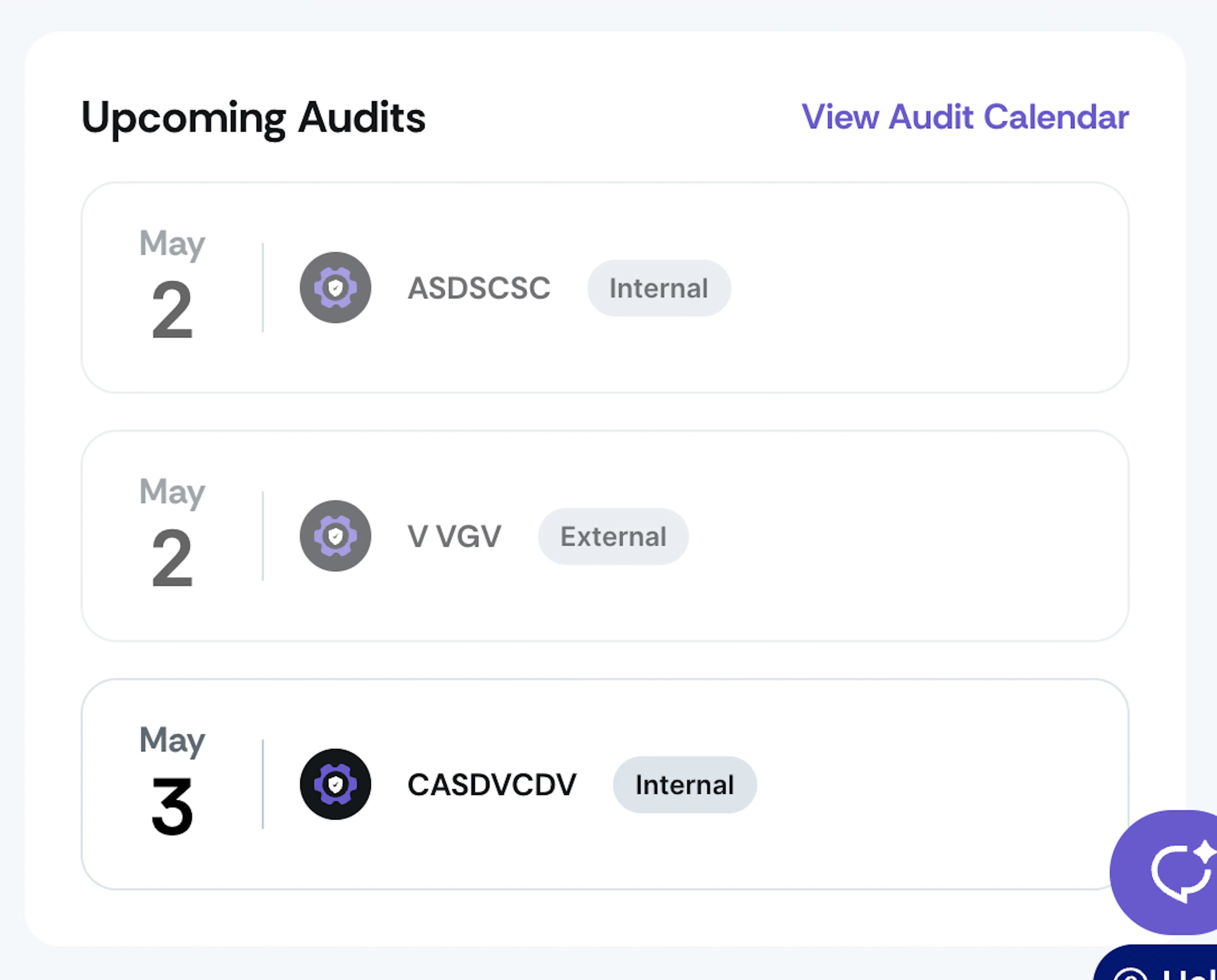
This section displays upcoming audits, helping you prepare and allocate resources accordingly. It includes:
- Audit date
- Audit name
- Audit type (Internal / External)
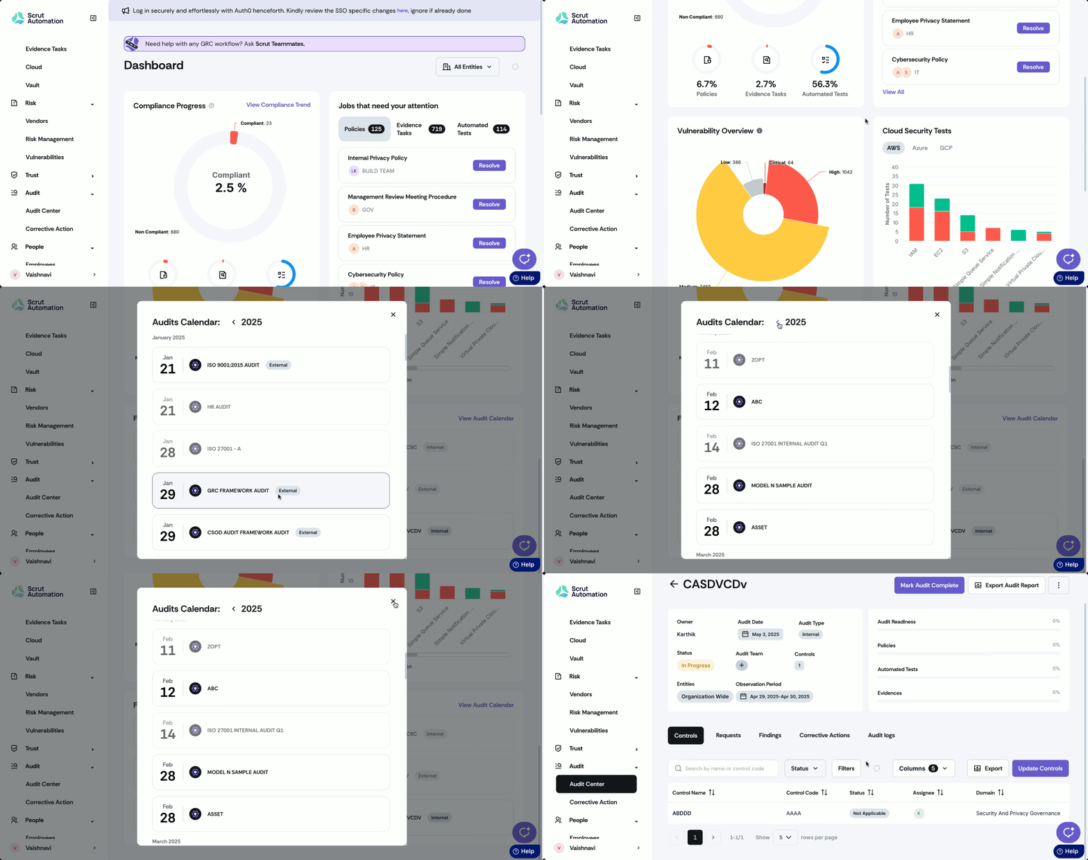
Click View Audit Calendar to see the expanded calendar view of all scheduled audits. Click on any audit to go directly to the corresponding page in the Audit Center.
Filtering by Entities
You can filter dashboard data by specific entities within your organization.
- Click on the entity filter dropdown (It includes All Entities by default).
- Select the specific entities you want to include in your view.
- The dashboard will update to show data only for the selected entities.
- Click the Reset icon to remove applied filters.
Heads Up!
The dashboard data varies depending on your Scrut role. Admins can see all data, while contributors can only see policies, evidence, and tests assigned to them.
Additional Tips
- Click the information icon (?) next to section headers to learn more about each chart.
- The View All option in each chart provides more comprehensive information.
- Click on metrics or numbers throughout the dashboard to go directly to the relevant page of the underlying data.