

Understand Trust Vault Dashboard
Who can use this feature
- Supported on Foundation, Growth, and Scale plans
Learn how to navigate and use the Trust Vault Dashboard to monitor portal views, track access requests, and identify your most engaged documents and users.
Accessing the Trust Vault Dashboard
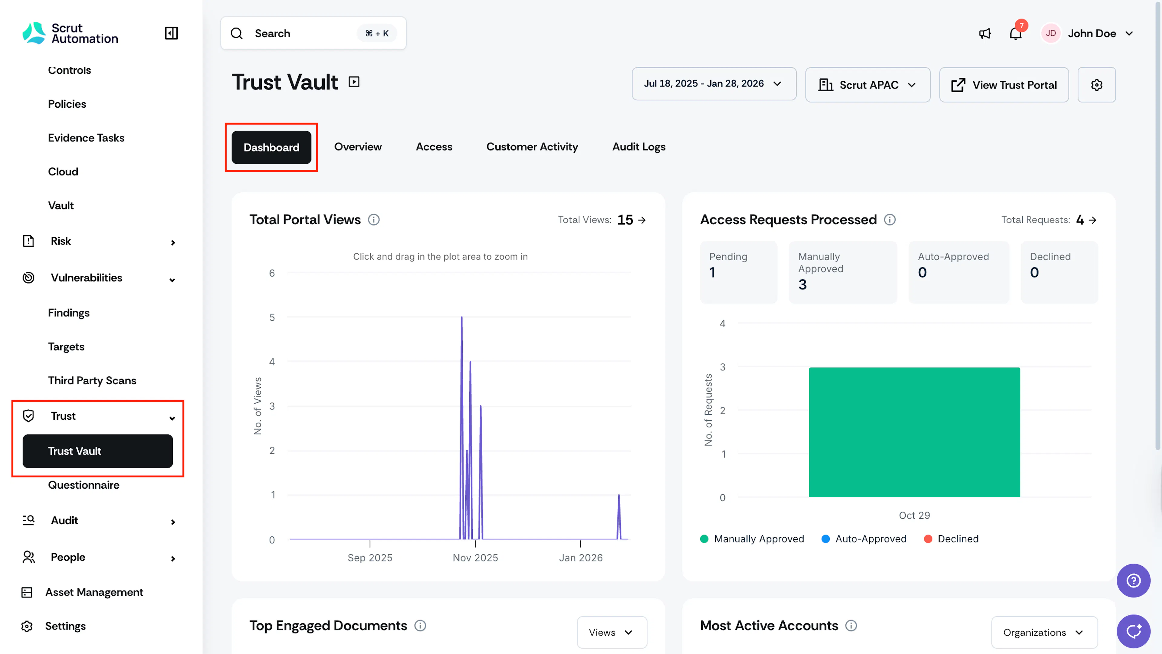
To access the dashboard, select Trust → Trust Vault on the left navigation panel. This brings you to the Dashboard tab, where you can view all insights.
Filtering Dashboard Data
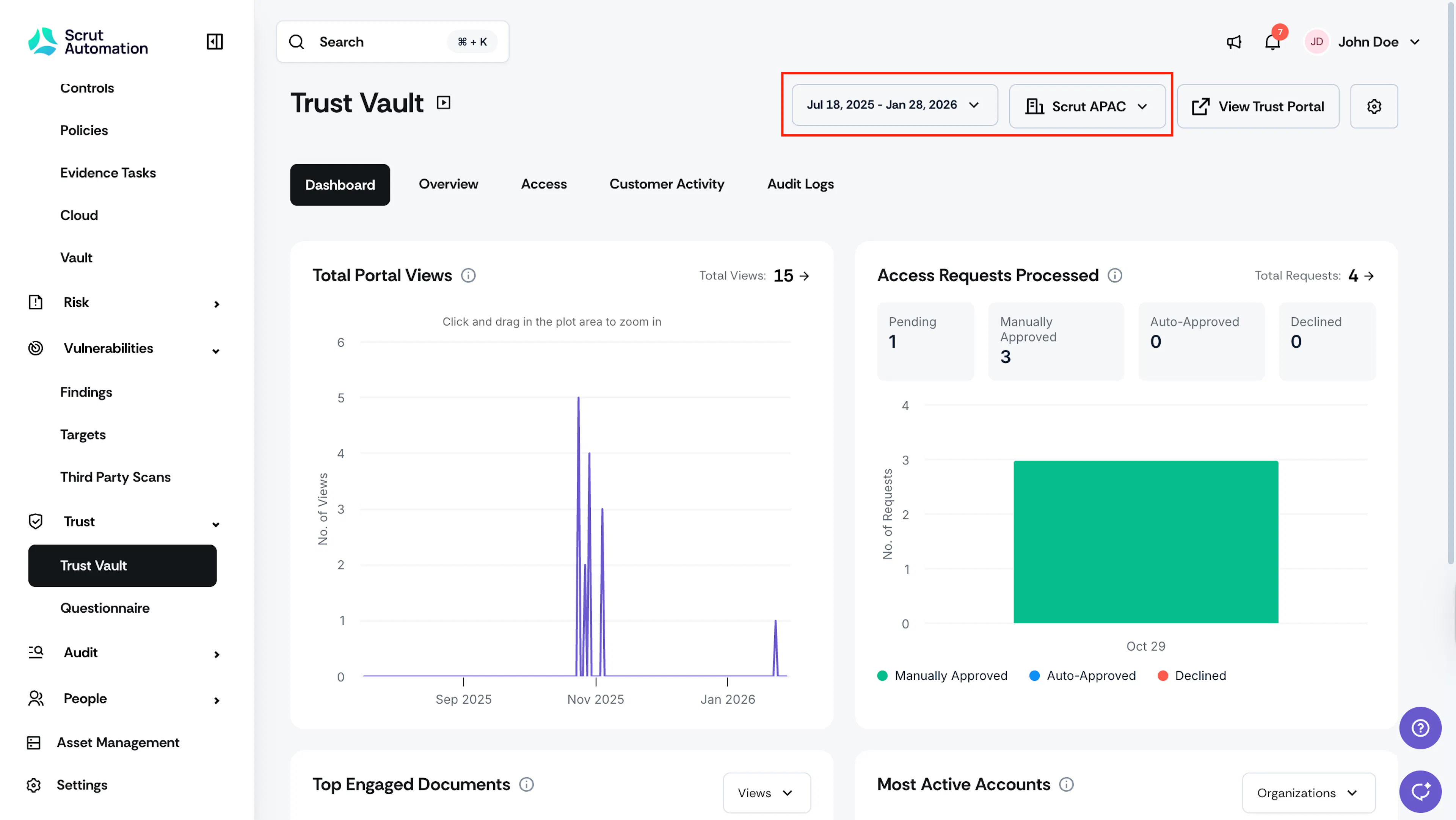
The Insights Dashboard provides a consolidated view of your Trust Vault's performance through interactive charts and metrics. All components update simultaneously when you adjust the time period filter, giving you a comprehensive snapshot of activity during your selected timeframe.
Time Period Filter
A time period filter at the top of the dashboard controls all charts and metrics. Available options include:
- Last 7 days: View activity from the past week
- Last 30 days: View activity from the past month
- Last 90 days: View activity from the past quarter
- Custom Range: Select specific start and end dates
Note:
By default, the dashboard displays all data from the day your tenant was created through the current date, providing a complete historical view of your Trust Vault's performance.
By Entities
If you manage multiple entities, you can filter all dashboard components by entity. When you select an entity, all graphs and metrics update accordingly, and any drill-down navigation to detailed views will maintain the entity filter.
Charts
Total Portal Views
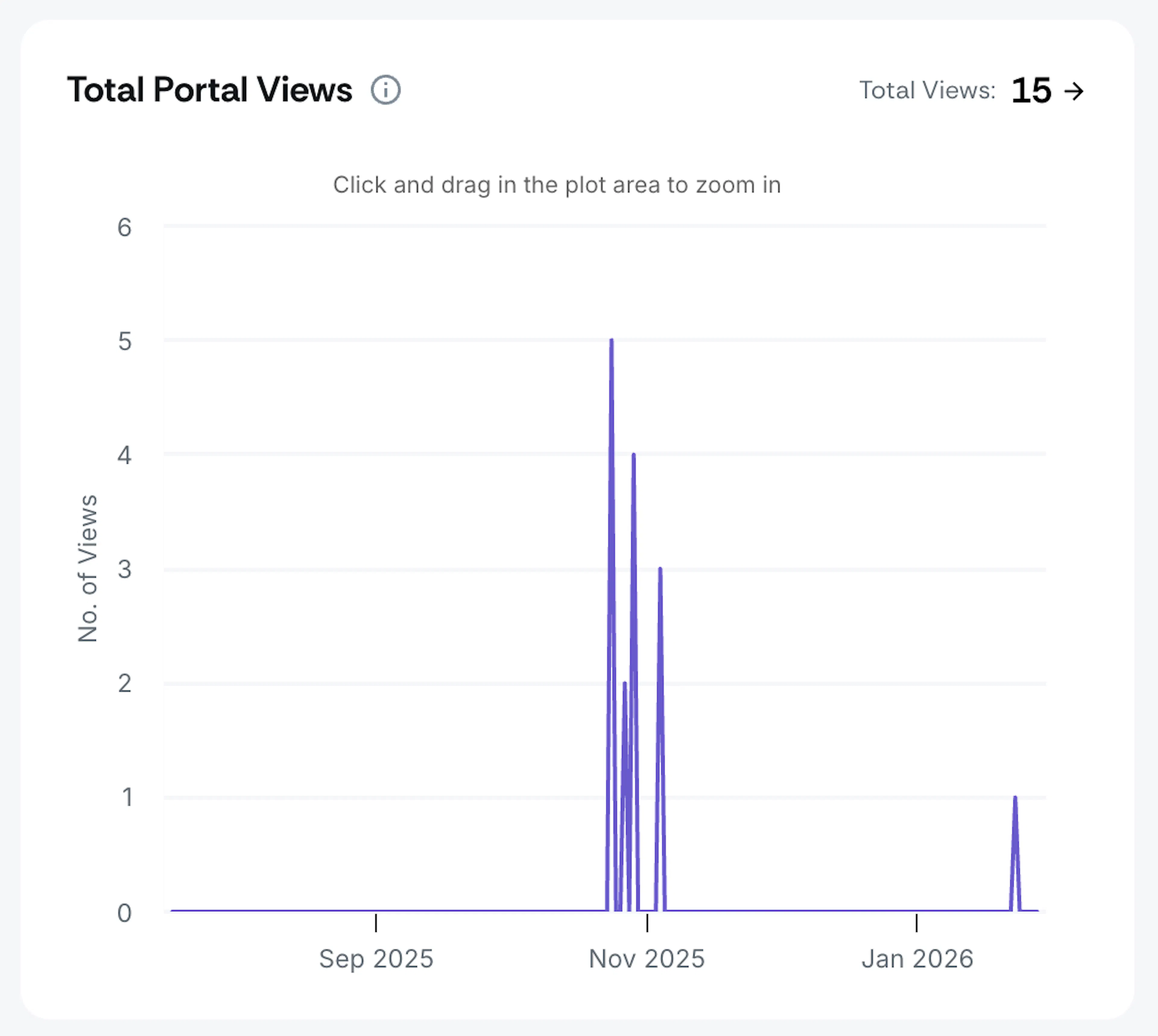
This chart displays the total number of Trust Portal views for the selected period. Each data point represents the total number of times users visited your Trust Vault portal.
Pro Tips!
- Hover over any point on the chart to see the date and exact visit count.
- Click on the Total Views count to navigate to the Customer Activity tab, where the data will be filtered to show only Trust Vault portal visits for your selected time period.
Access Requests Processed
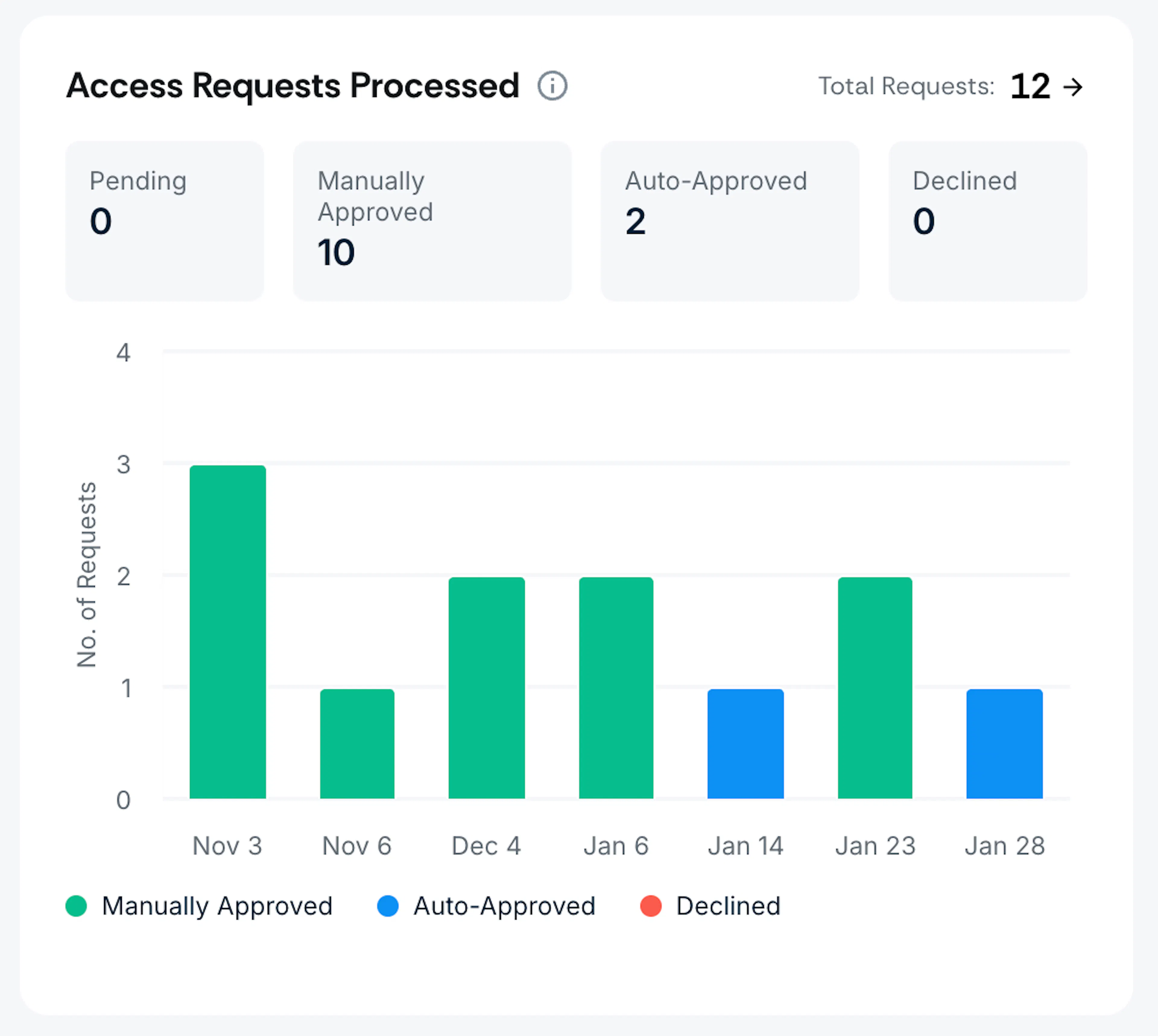
This chart shows the complete breakdown of all access requests over time. Each bar represents a time bucket based on your selected period and displays:
- Automatically Approved: Requests approved automatically based on your approval rules, such as Salesforce contacts
- Manually Approved: Requests approved manually by your team
- Declined: Requests that were declined
Pro Tips!
-
Hover over any bar segment to see the exact count for a specific day.
-
Clicking the counts at the top of the chart redirects to the respective tabs.
- Auto Approved redirects to Access → Approved with filtered results showing only automatically approved users within the selected time period
- Manually Approved count redirects to Access → Approved with filtered results showing only manually approved users within the selected time period
- Clicking the Declined count redirects to Access → Declined with filtered results showing declined users within the selected time period
Top Engaged Documents
This section displays the documents receiving the highest engagement, combining data from both public and private documents. Each entry shows:
- Document Name: The name of the document
- Total Views (count): Number of times users have viewed the document (for private documents, only users with access are counted; anonymous users clicking private documents are not included)
- Total Downloads (count): Number of times the document has been downloaded
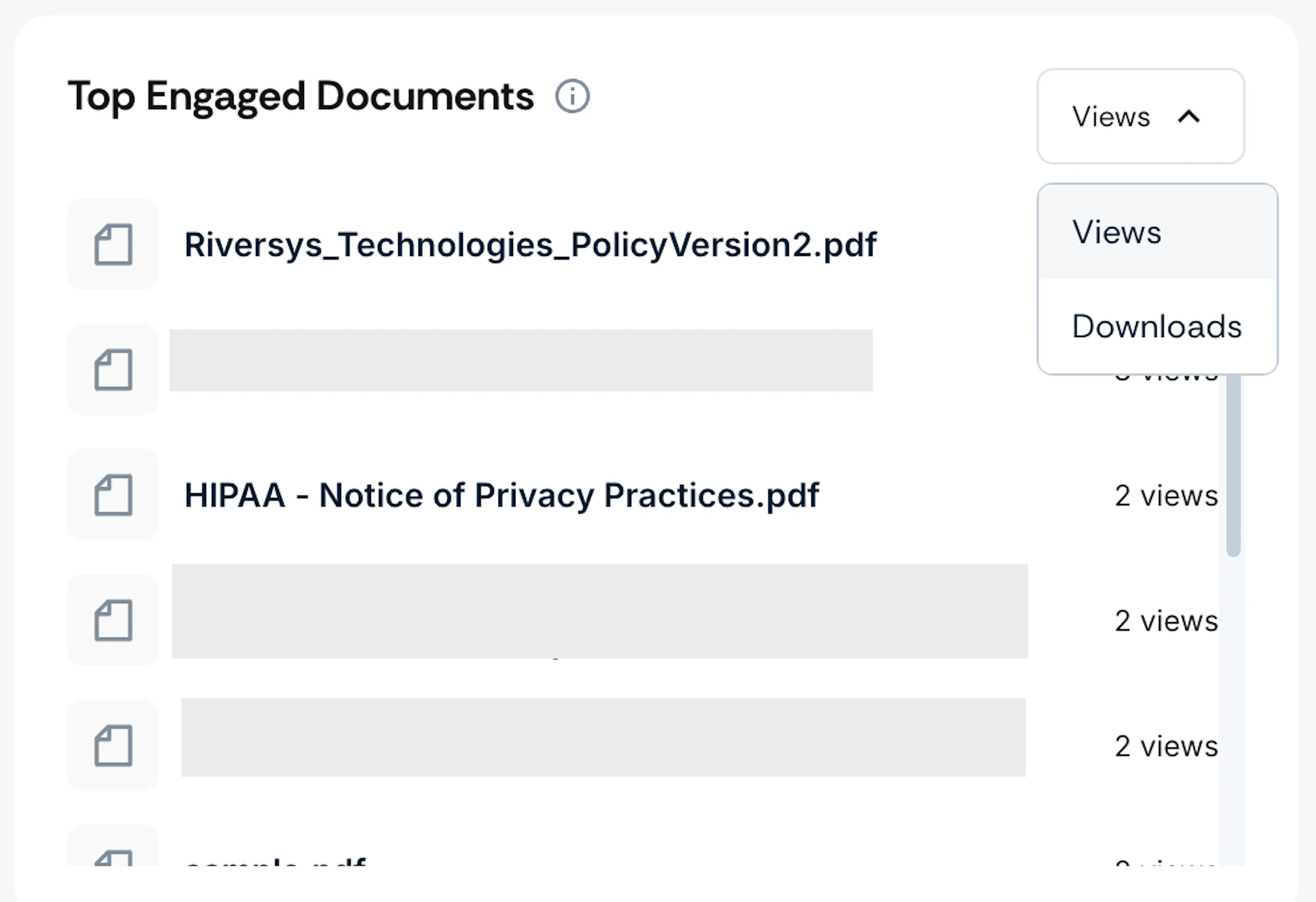
Pro Tip!
Use the filter to toggle between viewing documents sorted by Views or Downloads.
Most Active Accounts & Users
This bar chart displays the accounts or users with the highest engagement in your Trust Vault. Engagement is calculated based on the total number of page views, with each page load counting as one view.
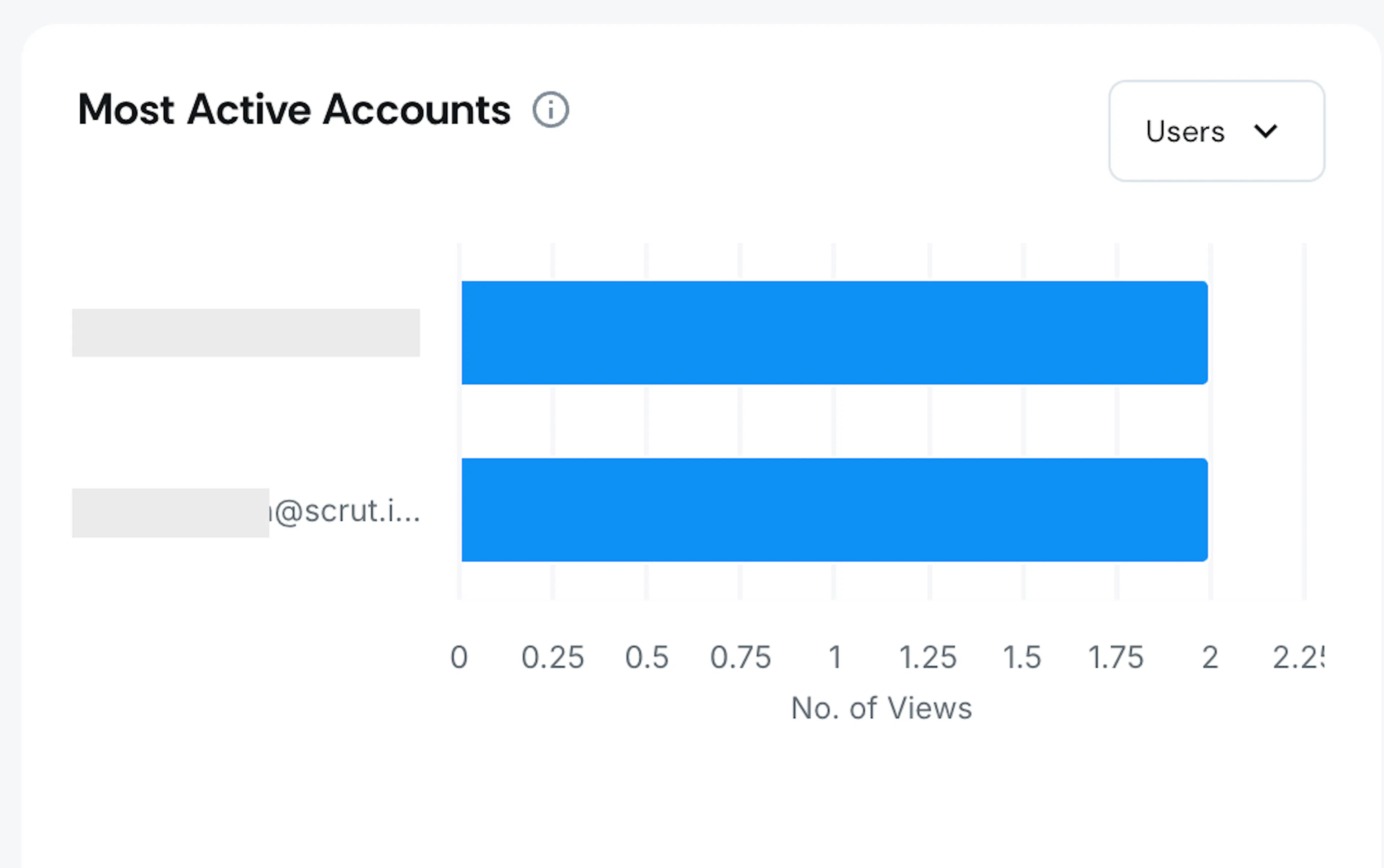
Pro Tip!
Use the filter to toggle between viewing Top Engaged Accounts or Top Engaged Users. The chart updates to show the five most active accounts or users based on your selection.
Best Practices
- All dashboard components are interactive. Click metrics and chart elements to drill down into detailed views with pre-applied filters that match your dashboard selections.
- Use the time filter strategically. Use broader time ranges (E.g., the Last 90 days) to identify trends. Narrow to specific periods (Last 7 days) to investigate recent activity.
- Hover over info icons next to each component to see explanations of what each metric measures.
- When managing multiple entities, remember that entity filters apply across all dashboard charts.